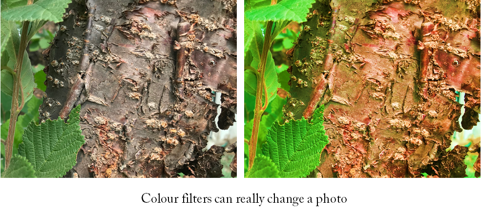
Duotone Photo Technique

Duotone Photos

I’ve been showing you how to use PowerPoint to quickly create stencil and lace effects. Now, let’s look at creating duotone photos. In addition to making a photo look very modern, duotone is a useful technique for using less than stellar photos.

Cat in the Kitchen

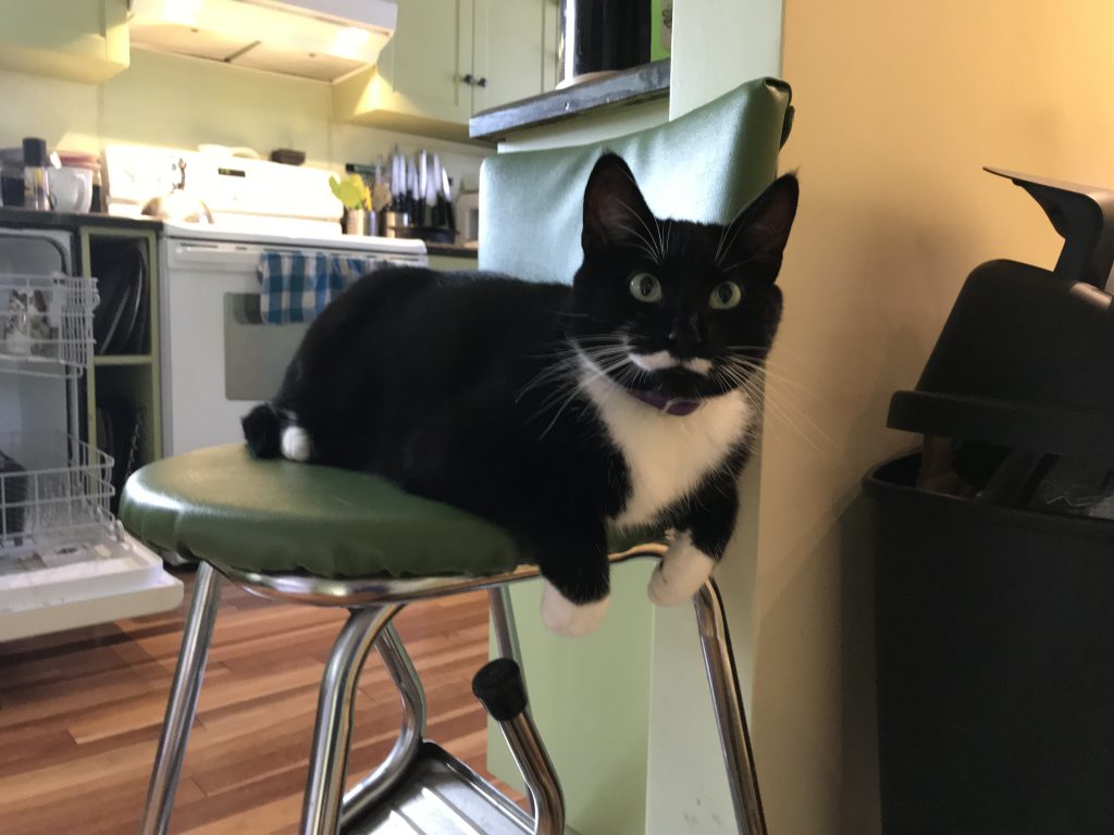
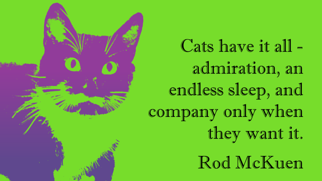
While the cat might be photogenic, the background is not. I want to move from the photo above to the duotone below, which is suitable for adding a quote.

So true

The first step is to crop the picture as closely as possible.

Just the handsome face here – no clutter

But unfortunately, once enlarged you see the photo is a little blurry. This won’t be a problem going forward and it shows how this technique can cope with less than perfect photos.

Going to Picture Corrections:
Brightness was set to 65%
Contrast to 100%

Picture Color: Saturation was set to zero.

The Adjusted Photo

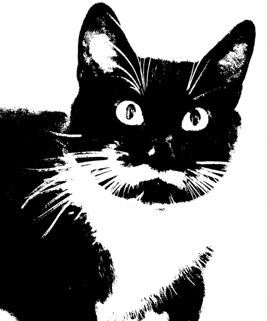
There is a bit of guesswork here, as I had to bring up Brightness enough to wash out the dark corner of the chair the cat is on, yet leave as much detail as possible. You’ll note that this brings out a lot of light spots on the pupils as well.

Why not just Recolor the picture to Black and White? In this case, I felt that recoloring removed too much detail from the photo. In the case of a different photo, recoloring might be the quickest and easiest method. I’d definitely try it first and see if I liked the results.

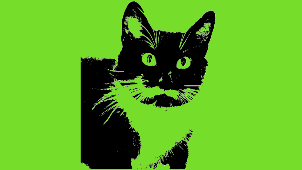
I’ve drawn a rectangle and filled it with a bright colour for contrast, this has been placed under the photo.

Now I can make the white portion of the photo transparent, by selecting Picture Tools>Format>Color>Set Transparent Color and clicking on a white portion of the picture.

The black portion of the photo remains.

What’s also hard to see in the above picture is that the photo has a lot of small grey artifacts in the borders of the fur. This is exactly what we added in when making the lace picture earlier, but here it is unwanted. An additional step is required for this photo (again for some photos it might be unnecessary).

But before I do that – I’m going to use the Ink command and touch up the pupils to remove some of the glints. Ink is only available in Office 365.

Showing Glint repair using ink tool.

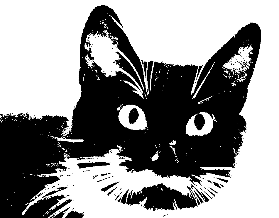
After filling in the glints on the pupils, I grouped the ink layer with the photo. Then I copied and pasted the photo (and ink layer) as a picture. PowerPoint remembers all the photo editing done to a picture (which is why the Reset command works) and applies those steps cumulatively. I want to start fresh and apply the Recolor command to strip out the grey artifacts without losing a lot of detail. After recoloring the photo to 25% Black and White I set the White color to transparent

The same photo, but now with a crisper look

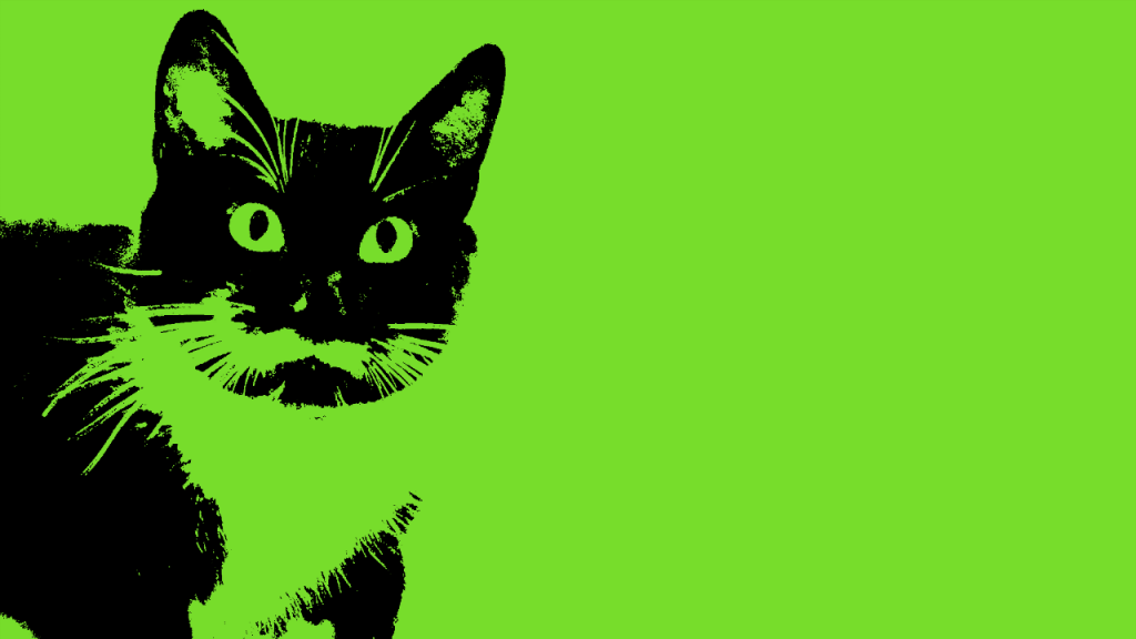
Again, I grouped the photo with bright background rectangle, pasted it as a picture and this time set the black portion as transparent. This is similar to the photo stencil.

Photo with transparent cat

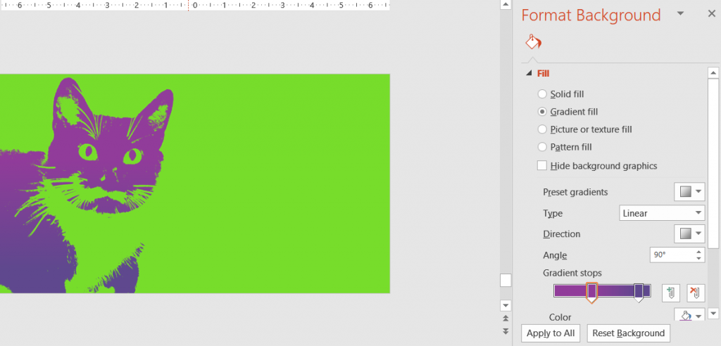
In the final step, set a gradient fill in your chosen colour scheme to colour the duotone.

Setting the background of the slide to colour the duotone

The main elements of this technique are applicable to a number of photo effects. Try them out and see what you get!


This post is originally from 2018 If you want help with the newest and classic features in PowerPoint drop me a line at catharine@mytechgenie.ca

Eat Your Waffles

Ok, don’t eat the waffle chart

In a previous post, I discussed making a Button Bar Chart. That whole process really inspired me to think about simplified charts for presentations.

Which got me thinking about Waffle Charts.

Note how the smallest group stands out

Waffle charts are excellent for looking at data sets where the smallest numbers are the important ones. You can use colour (as I have above) to make those numbers stand out.

But oddly, I don’t see people using a lot of waffle charts in their presentations. And there is no template for a waffle chart in Excel.

You can find some interesting ideas about building Excel waffle charts for dashboard purposes and I recommend this article to you: Interactive Waffle Charts in Excel

However, I was looking for something different. Something that wouldn’t have me counting and colouring cells manually (shudder).

Building the Waffle

I chose to build the waffle chart using a series of conditional formatting rules. The first step was creating the formula to count the cells of the waffle.

Counting the cells in a 100 grid waffle

In case the picture is a bit small, the formula used here is:
=(MOD(ROW()+8,10)*10)+(COLUMN()-2)+1

This uses the row and column position of the cell to count from 1 to 100 in a 10 by 10 grid.

I then built on that base formula with this monster formula:

=IF((((MOD(ROW()+8,10))*10)+COLUMN()-1)<=’5 Category Waffle’!$A$2,’5 Category Waffle’!$A$2, IF((((MOD(ROW()+8,10))*10)+COLUMN()-1)<=(‘5 Category Waffle’!$A$2+’5 Category Waffle’!$A$3),’5 Category Waffle’!$A$3, IF((((MOD(ROW()+8,10))*10)+COLUMN()-1)<=SUM(‘5 Category Waffle’!$A$2:$A$4),’5 Category Waffle’!$A$4, IF((((MOD(ROW()+8,10))*10)+COLUMN()-1)<=SUM(‘5 Category Waffle’!$A$2:$A$5),’5 Category Waffle’!$A$5, IF((((MOD(ROW()+8,10))*10)+COLUMN()-1)<=SUM(‘5 Category Waffle’!$A$2:$A$6),’5 Category Waffle’!$A$6,0)))))

The sheet BTW is called 5 Category Waffle.

The 5 category waffle formula result

The formula checks the position number of the cell generated by the base formula and sees if it is less than or equal to the number of values in each category in column A. It then returns the value of the category in each cell.

Because I wanted to put symbols in the cell like these examples.

Talking Heads waffle chart
Bombs waffle chart

I took that monster formula and made it into a named formula.


This made building the conditional formatting rules much easier to do(simply because the conditional formatting dialog is so cramped).

Lastly, I built a series of conditional formatting rules to change the background colour of the cell based on the value returned by the formula. For the waffles using symbols, the rule formats the colour of the font, instead of the background.

A couple of additional pointers

  • To create a perfect grid, switch the view in Excel to Page Layout View. Page Layout View uses the same measurement scale for both row height and column width. Set your measurements here.
  • For the symbol waffles, use the File> Options>Advanced> Display Options for this worksheet and turn off the display of gridlines. That way when you copy the waffle, the gridlines will be invisible.


This post is originally from 2018. If you want help with the newest and classic features in Excel & PowerPoint drop me a line at catharine@mytechgenie.ca

Button Bar Chart

Simple or Complicated?

Simple or complicated? It’s been my observation that anyone can make a subject sound complicated – but it takes real understanding of a topic to simplify it in a way that is meaningful.

This is why, when I saw this sample slide below from designer Julie Terberg, I sat up and paid attention. Here is a wonderful example of a chart that is simple in a beautiful and useful way. Immediately, you can see that an audience would find this chart easy to read and understand

Julie Terberg’s Button Bar Chart from her #SlideADayProject project

I paid even more attention when I saw the way that Neil Malek put together an Excel version of the chart. Neil introduces a clever technique using shapes in data labels.

Unfortunately, Neil’s clever technique was only available in Office 2016. I wanted to build the chart in Office 2010, for the benefit of my clients still using 2010.

Button Bar Chart Slide, in PowerPoint 2010

I think that in the end, I succeeded. If you are interested in building this chart, and like me you are restricted to Office 2010, then I have a few pointers for you.

Button Bar Chart Pointers

  • Data Labels in 2010 can not use shapes. Instead, I tweaked the Shadow setting for the label, by setting the colour to match the fill on the label and the size to 150%. I left all other settings to zero. Shaping the label this way means that you can never achieve the circle that Julie used in her example. Instead, the best you can do is a lozenge shape. You can modify this when you change the font size in the label.
  • But once you’ve used the Shadow to enlarge your button, you can’t use it to shadow the data label. I solved this problem with an old fashioned solution. I made two charts (a 2016 and a 2017 chart). The two charts are grouped together. Each chart has a data label for the year and a data label for the shadow. In the example below those labels are using the 1 values. The column labelled 2016 value is the length of the bar.
Button Bar Chart Data layout
  • The Shadow column must proceed the 2016 column or your shadow will wind up on top of the 2016 label. Also format your labels in that order as well, or the shadow will temporarily be on top of the 2016 label.
  • Format your shadow and label to the same font size.
  • The Chart Element selector on the Format Tab of the Chart Tools ribbon is your friend. Its’ really the only reasonable way to select the shadow data labels once they are under the visible label.
  • Link the label text to the cell in in Excel by using the formula bar and typing in the linking formula to the cell. This allows you to update the chart, by changing the text in the cell. A bit finicky to set up; but it will save a ton of time in the long run.
  • The best way to take this chart into PowerPoint is by copying/pasting the chart – as an image. Which means that you’ll need to presize the chart in Excel, so that text is not distorted by resizing once it is pasted into PowerPoint. Again, its a bit finicky – but worth it.
  • In PowerPoint, I created a layout, with text placeholders on the left and bottom of the slide.

    Layout has text placeholders on left and bottom of slide

All in all, a pretty reasonable version of Julie’s stellar design.

If you want to follow Julie Terberg and Neil Malek on Twitter, you’ll find them here.


This post is originally from 2018. If you want help with the newest and classic features in PowerPoint drop me a line at catharine@mytechgenie.ca

Generating Random Numbers and Letters

Need to generate a random number? Excel has two formula variations that can do that for you.

The first is RAND, it generates a random value between 0 and 1. But if you need larger values, try RANDBETWEEN.

RANDBETWEEN generates random numbers between a bottom and top value that you specify.

Lastly, if you need to generate a random letter value – try this formula: =CHAR(RANDBETWEEN(65,90))

In this formula the CHAR function returns the character symbol specified by a number. Letters A-Z are between 65 and 90.


Pictures and Transparency

In my last post, I mentioned I was working on a Jeopardy game in PowerPoint. In this game I want to present a series of visual clues before the answer is revealed. The audience is presented with the foreign cover for a popular book and has to guess the name of the book.

Can you guess the book, by seeing its foreign (Greek) version cover?

I want to slowly reveal the English book cover, by gradually making the foreign cover more transparent. With this particular cover, I also wanted to crop the foreign cover image to reveal additional clues. Each clue will be revealed by a click of the mouse.

Hmm is this a problem? I can not control image transparency in PowerPoint, there is no option for this in the Picture Tools menu.

Nope, no problem at all. You can control image transparency by:

  1. Create a shape the same dimensions as your picture.
  2. Remove the outline for the shape.
  3. Change the fill option to Picture or Texture Fill and insert the picture file.
  4. Transparency will now be available

Its’ interesting that placing a picture inside a shape allows you to manipulate that picture as if it was a shape. This concept allows me to play with things like irregularly shaped (non-rectangular) images as well.


This post is originally from 2018, looking at PowerPoint 2016. Our options for pictures and transparency have improved since then.
If you want help with the newest and classic features in PowerPoint drop me a line at catharine@mytechgenie.ca

PowerPoint Links

I’ve just been working on a PowerPoint template for a Jeopardy style game. I inherited this template, and as frequently happens a little cleanup is necessary to ensure the PowerPoint template works as desired.

To help you visualize the problem – a picture of the game board

The Game Board

Each square hyperlinks to a separate slide with the question (and answer).

I felt there were a number of improvements I could do to make the presentation easier to use and maintain. I won’t go into every change today, but a couple of changes involved hyperlinks
(shortcut key Ctrl + K, if you are editing 25 hyperlinks, then the reason for using a shortcut key becomes obvious).

The first maintenance problem I ran into was that the previous designer had applied the hyperlink to both the shape AND the text on the shape (now there are 50 hyperlinks – if you are counting).

Shape with text on top

They did this for a very good reason; that the text on a hyperlinked shape does not change state like normal hyperlink does (the state change shows if the link has been visited or not).

So if the slides the shapes are linked to are reordered or edited, the links have to be painstakingly tracked down and edited and since essentially the links are layered one on top of each other it is a real pain.

I had a better plan. Move the button shapes to the Slide Master (after creating a layout designed for the Game Board slide). Then insert text placeholders (yes, 25 of them) for the dollar values. Position the placeholders over each button. No hyperlinks here.

Now moving back to the Game Board slide in Normal View, I can hyperlink the text box. Text boxes behave differently from shapes, and do change state to show the link has been visited.

Another advantage of the text placeholder is that if the user inadvertently moves the text boxes, the Reset command will snap them back into position. (A definitely plus when editing 25 text boxes).

The other visual difficulty I had, was with the colours of the hyperlinks themselves. They didn’t have a strong contrast with my (new) button colour, and the visited colour was still (kinda) visible. I wanted a strong link colour and once visited I wanted the link to disappear. I could add animations, but why bother when I could solve both problems easily by changing the link colours in the Color Theme.

Theme Colour Panel PowerPoint 2016

Here is the theme colour panel after I adjusted the Hyperlink and Followed Hyperlink Colours.

The colours in the theme were picked after playing with the free https://coolors.co/ app I also got some good advice from this article. The image at the top of the article is the colour palette created by the Coolors.co app – translated into RGB. I usually add this information as a layout in the slide master.


This post is originally from 2018 If you want help with the newest and classic features in PowerPoint drop me a line at catharine@mytechgenie.ca

A little bit of history – lost … and found

Excel has been around for decades, so it isn’t surprising that there are many features tucked away under the hood. What is surprising is when a useful feature is lost and only careful archeology can bring it back to life.

Excel 4.0 had a rudimentary macro language, mostly using excel formula approaches to building functionality. This was replaced by the VBA programming language. But there are still useful little items tucked away in this early language that haven’t been replaced.

One of these is Get.Cell.

Get.Cell had a boatload of switches that allowed the user to pull information about the cell formatting and contents and most of these have been replaced by the Cell and Type functions in Excel.

But one piece of information that Cell and Type can’t tell you is whether your cell or cells contain formulas vs values and sometimes this is a very handy thing to know at a glance. For example, if you build a spreadsheet using formulas to estimate amounts; but then start to drop in values as more concrete information becomes available.

In this situation I like to format cells containing formulas differently from the cells containing values, so that I can see at a glance where my estimates are. Its’ handy to have the formatting change automatically, so I don’t have to remember what my rules are weeks or months later.

This is where Get.Cell shines. The syntax I’m going to use is

=GET.CELL(48,A1) – where A1 is the cell I’m going to reference.

The trick here is that Get.Cell is NOT entered in a cell, but instead as a named formula. After creating the named formula, I can reference it while applying conditional formatting. In this way, when the type of content in the cell changes the conditional formatting automatically updates.

Where does one find information about the Get.Cell function? Not from Microsoft or at least not easily from Microsoft.

Try this post https://www.mrexcel.com/forum/excel-questions/20611-info-only-get-cell-arguments.html to see the possible switches for Get.Cell


First published in 2017, the Get.Cell function remains useful today. I remain hopeful that MS will incorporate its’ functionality in newer versions of Excel. If you want expertise in Excel, drop me a line at catharine@mytechgenie.ca

Highlighting the Current Year

Here is a version of a spreadsheet that I’ve been using for a couple of years to track and plan capital purchases. A number of people review this spreadsheet and I want to make it as easy as possible for them to read the spreadsheet. You’ll notice that the Budget year is highlighted in green and items being purchased in that year are highlighted as well. This is accomplished with our friend conditional formatting and the following spreadsheet functions:

  • ADDRESS
  • ROW
  • COLUMN
  • MATCH
  • INDIRECT
  • ISBLANK
Spreadsheet with automatic highlighting
Capital Budget Spreadsheet – note the row and column (year) highlights

This spreadsheet makes use of a helper column of formulas. Rows where the value equals TRUE are highlighted.

The Helper column holds formulas

Cells give a value of TRUE when there is a value for that row in the Budget Year selected in cell A1. You can see that 2017 has been selected as the Budget Year and that rows 9 and 20 have a value for that year and are highlighted as a result.

This is the formula that returns the value

=ISBLANK(INDIRECT(ADDRESS(ROW(),MATCH($A$1,$F$2:$AU$2,0)+5,3,TRUE)))=FALSE

Working from the interior of the formula outward.

MATCH($A$1,$F$2:$AU$2,0)

This looks for a match between the value in A1 and the Budget year headings which start in cell F2 and go to AU2 (the year 2033, which is incredibly optimistic – but that is another story). MATCH returns the number of the first item in that array of cells that matches the value in A1. This is why even though there are two columns for every year (a Budget column and an Actual column) MATCH will only return the Budget column, as it is the first value to match.

So the result of MATCH($A$1,$F$2:$AU$2,0) is 9

However, if I actually want to capture the column I need to to add 5 to compensate for the fact I have 5 columns (A-E) before column F and the year headings begin. This is why I’m adding 5 in the formula.

MATCH($A$1,$F$2:$AU$2,0)+5 =14

In the next step I use ADDRESS and ROW to capture the address of the cell I’m testing.

ADDRESS(ROW(),14,3,TRUE))

ROW() captures the value of the row of the cell where the formula is written. If the formula is in A3, then row() returns 3.

ADDRESS turns the cell address of the referenced cell (not its’ contents). In our example; ADDRESS(3,14,3,TRUE)=”$N3″

The ISBLANK function in the next step has a bit of a hiccup with that “$N3” string, so we use INDIRECT to convert that string to something ISBLANK can understand.

Finally, ISBLANK is used to test if there is a value in the referenced cell or not. If there is nothing in the cell ISBLANK = TRUE.

If ISBLANK = TRUE, then the last portion of the formula looks like this: TRUE does not equal FALSE, so the result of the formula in cell A3 is FALSE.

I could have put that formula into the conditional formatting dialogue – but for clarity and ease of working I choose to make the helper column instead.

In the conditional formatting dialogue I’ve used the following formula =$A3=TRUE

I’m using a simpler version of the formula in the conditional formatting dialogue to highlight the year.

=MATCH($A1,$F$2:$AU$2,0)+5=COLUMN()

In this case I find the column number of the year and test to see if it matches the column number of the current cell. If it does then the cell receives a green highlight fill.

Cell A1 uses Data Validation to offer the user a nice drop-down list of years.


This post is from 2017. The technique is still valid and very useful! If you want help with the newest and classic features in Excel drop me a line at catharine@mytechgenie.ca

Making Powerful Image Quotes

For those of you who haven’t had one of my seminars on using PowerPoint to create powerful image quotes for your social media feed; now’s the time to get out into the garden with your camera phone and take a few photos.

Chrysanthemum

You need to create a stockpile of good background photos that you can use for fresh quotes. And summertime in your garden is a great time and place to do this.

Closeups of plants and flowers make a great background for a variety of quotes – like this one I found on the Olds Municipal Library Facebook feed.

A wonderful quote from Jo Walton.

You can see how they use a transparent overlay over part of the picture to help the text stand out.

You may not have an immediate need for those pictures, but you can set them aside for later use, like this image of purple pink chrysanthemums (my chrysanthemums are looking particularly lovely this year, due to the fact I’ve just bought them).

You know you’re in love when you can’t fall asleep because reality is finally better than your dreams.” ― Dr. Seuss The colour of these flowers, will do nicely for a different Valentines’ Day image quote.

You don’t need a fancy camera to get these pictures, the camera on your phone will do just fine. But do make sure you take your pictures in both horizontal and vertical orientations to make sure you have more layout options later on.

When you don’t know how you’ll be using those photos, options are very good.

Don’t just focus on flowers (hehe, see what I did there), leaves and foliage are useful too.

Hey! I think I see a face in there!

Don’t forget that the same picture can be used multiple ways, once you start throwing colour filters and special effects at it.

Left is original photo – the right has the saturation cranked up.

Oh, and that image has been flipped, since I like the leaves appearing on the left side of the photo better.

A final tip, when saving your image quotes, use the PNG format, it creates fewer artifacts (small jiggly lines that make text harder to read) than JPEG.


This post is originally from 2018.  If you want help with the newest and classic features in PowerPoint drop me a line at catharine@mytechgenie.ca

PowerPoint – Making a Mask

Creating a mask effect in PowerPoint is easy, once you’ve located the Shape Combine command. You can add this command to the Ribbon or the Quick Access Toolbar.

Below, you see it being added to my toolbar.

Adding the Shape Combine Command to the Toolbar, alternately look for the Combine Shapes command as more options are available.The command will not be active until there are two shapes selected. Below, I’ve created a blue rectangle and a red oval. The oval shape will be cut out from the rectangle.

Blue rectangle with red oval positioned for the cut out. You may prefer to add the Combine Shapes command instead. More options are available as you can see below.

The result of the Shape Combine command, a rectangle with an oval “hole: in the center.

The result of the Combine Shapes CommandOnce the mask is created, you can dress it up. Below, I’ve changed the fill to an image of a leafy forest floor.

The forest floor has a hole in it. Now I can layer whatever image I wish (in this case a frog) under the mask. You can animate the layer underneath the mask. Can you image a wheel of creatures rotating into the viewpoint in the center of the mask? That would be great for a talk about ecology!


This post is originally from 2016. If you want help with the newest and classic features in PowerPoint drop me a line at catharine@mytechgenie.ca
Frog image via Wikipedia