In a previous post I showed how I entered a column of repeating dates when building my Social Media spreadsheet. The next thing I like to do, is colour code those dates so that I can see at a glance when the weekend dates are. For this I use the WEEKDAY function in Excel.
Weekday Function Example
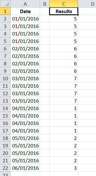
Point the WEEKDAY function at a date and it will return a number from 1 thru 7 indicating what day of the week the date is. In this case the formula reads =weekday(A2,2)
The 2 in the above formula is the return type, and here indicates that the week starts on Monday. This means that Saturday and Sunday will return values of 6 & 7.
This is perfect for using with conditional formatting.
If I plug the following formula into the conditional formatting dialog box
=(WEEKDAY(A2,2))>5
I am testing for values above 5, namely the weekend. So I can use this to put a colour fill in those dates so that they stand out.
Weekday function with Conditional Formatting
Obviously, the Results column isn’t needed because the formula is actually residing in the Edit Formatting Rule dialog box.
This is the second post discussing using Conditional formatting with a Social Media spreadsheet. Check out this previous post for another example of using conditional formatting.
This post is originally from 2016. If you want help with the newest and classic features in Excel drop me a line at catharine@mytechgenie.ca
When I’m setting up my Social Media spreadsheet in Excel, I like to limit the number of scheduled Facebook entries per day. Over time, I’ve come to think that 4 Facebook entries per day is a reasonable maximum. This lets the librarian post “live” when things are happening in the library without clogging up our follower’s feeds.
So I want to create a column of dates that looks like this:
Each date is repeated 4 times
The quickest way to do this with minimal typing is to use the Fill Series dialog box. Since Excel 2007, you can find it under the Fillmenu on the Hometab.
Finding the Fill Series Dialog
To use the Fill Seriesdialog, select the range of cells you want your dates to be entered in. Make sure the first cell in the range has the starting date. Then select the Fillbutton and choose Series.
The Fill Series Dialog
Enter a Step value. In this case, because I want 4 repeats of each date I’m using .25 as the Step value. If I wanted 5 repeats, I’d use .20 (and so on).
If you don’t feel like calculating how many cells to select when doing this for a date range that spans a couple of months; try using a Stop value . With a Stop Value, the series will stop at the first instance of the date entered into the field. Otherwise, the series will fill the entire selected range. ( In the picture above the full date is not displayed in the field, it was actually 06/01/2016.) Using a <em><strong>Stop Value</strong> </em>allows you to make a rough selection (say 500 cells) and Excel will stop when the series runs its’ course.
This post is originally from 2016, however Filling a series is still as useful in 2020 as it was then.
If you want help with the newest and classic features in Excel drop me a line at catharine@mytechgenie.ca
Sometimes, when you’re teaching, its not about the complexity of the subject. Sometimes its a very simple piece of information that students get the most “mileage” out of.
When I’m teaching students MS Excel, the simplest thing that I teach them about is Named Ranges. Its the simplest thing to talk about, but the uses for ranges go on and on.
A plain spreadsheet.
Above you see a standard Excel spreadsheet. Adding a range name or two (or ten) can help make it much easier to work with.
Type the range name into the Cell Address box. Press Enter when done.
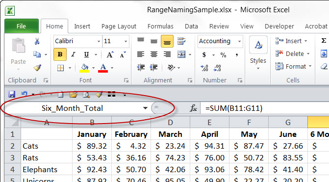
A range name can refer to a single cell or a group of cells, here I’ve selected the cell containing the total for the six month period (H11).
Click into the Cell address box (circled in red) and type in the desired name. There are some simple rules about naming ranges; the name can’t start with a number, can’t look like a cell reference (imagine how confusing that would be) and can’t use spaces and special characters (notice I’ve used an underscore to separate words). But after that it is up to you, to make your range name meaningful.
Adding a range name to a group of cells.
If you are going to add a range name to a group of cells, select them and type the name into the cell address box. The most frequent mistake students make at this point, is that they forget to press the Enterkey to confirm the range name.
Now, how do you use these range names?
Navigating your spreadsheet using range names.
First, you can quickly jump to your named ranges by using the drop-down menu. When you click on the drop-down menu in the cell address box, you’ll see a list of all the ranges you’ve added to your spreadsheet. Regardless of what sheet they are on. So you can use this to quickly jump to those cells that you work with again and again.
Range Names can replace cell references in formulas.
Second, you can replace cell references in a formula with range names. Does =SUM(January) seem easier to read and understand than =SUM(B2:B10)? Then a formula that uses range names will make your spreadsheets easier to read.
Third, you can use range names in conjunction with all sorts of other Excel tools. As an example, try using range names with the Data Validation tool.
A Named Range provides the source for this data validation list.
In the sample above, a range name provides the source list for a drop-down list.
Data Validation Result
Resulting in this drop-down list. The list will update as the list of animals changes on Sheet1.
This is a more elegant solution for using drop-down lists, since it means your source lists can be kept on another sheet, and not clutter up the working area. This is something that is impossible to do, without using a range name.
So faster navigation, easy to read formulas and access to more powerful features in Excel. What’s not to love about range names?
Looking to make a powerful spreadsheet or do you want me to make it for you? Drop me a line at catharine@mytechgenie.ca
I’m a big fan of Excel’s conditional formatting feature. I use it a lot in my spreadsheets to check on the quality of data, find errors and many other tasks. Here is the first of a couple of examples of how I’m using conditional formatting in my social media spreadsheet.
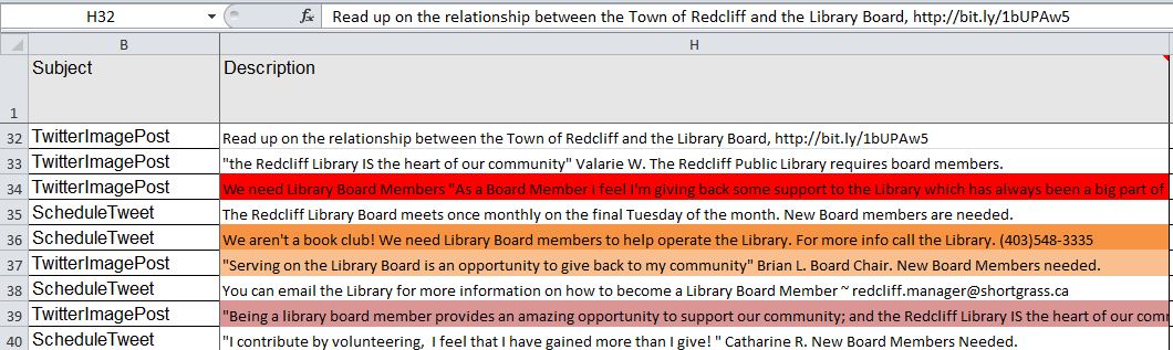
Just a bit of background on the spreadsheet. I use this spreadsheet to compose Facebook Posts and Tweets for the Redcliff Library. I also use it to schedule when the posts/tweets will be published. This allows me to sit down and plan a coherent sequence of posts/tweets.
I often take the Facebook posts and cut them down to shorter lengths and reuse them on Twitter. Twitter has a character limit of 140 characters. However, I don’t want to use all 140 characters if I can avoid it. Its’ generally recognized that the ideal tweet length is around 120 characters. This length allows others to retweet and add hashtags without having to edit the tweet.
So I have created 4 conditional formatting rules to help me meet this length limit.
The background of the cell turns bright red [STOP] if the tweet is over 140 characters.
The background of the cell turns dull red if the tweet is over 135 characters.
The background of the cell turns bright orange [WARNING] if the tweet is over 125 characters.
The background of the cell turns dull orange if the tweet is over 120 characters.
Why four rules? I could use 2 warnings only; at 120 and 140 characters respectively. In fact, that is where I started. But, writing tweets can be a tricky thing and I found I needed a little wiggle room to help me when I compose. The other thing to keep in mind is that the conditional format isn’t applied until I finish editing the cell (by pressing the Enter key or the checkmark). It is possible to have an interactive format applied using VBA, but those functions are memory intensive and slow down the whole spreadsheet. Since my writing process seems to involve a lot of pauses to think, stopping to apply the conditional format isn’t really a big problem for me.
So what does it look like in action?
Conditional Formatting Results
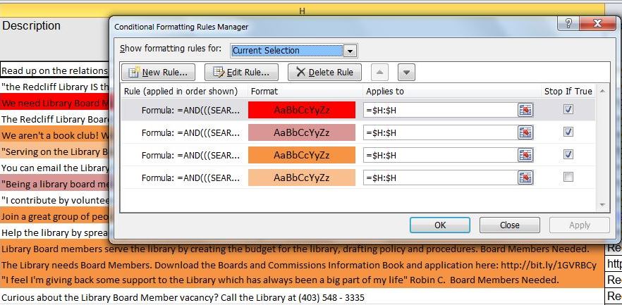
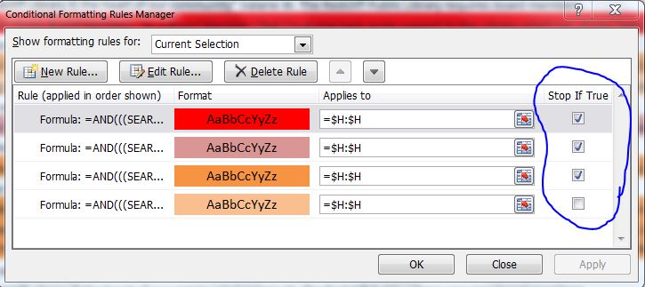
As a result, I can quickly identify which tweets need to be edited. Here are the 4 rules as displayed in the Conditional Formatting Dialog box.
These are formula based conditional formats.
The formula the conditional format is based on.
A conditional formatting formula must return a value of TRUE in order to fire. The following formula uses the AND, SEARCH and LEN functions
=AND(((SEARCH(“TW”,B1))>0),LEN(H1)>140)
If you were reading this formula in something like english it would read: “If the letters TW appear in column B AND the length of text in this cell is more that 140 charactersthe result equals TRUE”.
Why am I testing for the presence of TW in the subject column? Remember I said that I had both Facebook and Twitter posts in the same spreadsheet. I don’t want the conditional formatting to flag Facebook posts, which by their nature are longer.
Pro Tip:
When you are writing a formula for conditional formatting, do it in a cell in the spreadsheet first. The dialog for conditional formatting is really cramped and you don’t get any help features. After you are sure the formula works, you can then copy/paste it into the dialog using the Ctrl + Vkeyboard shortcut. Also, because I planned on apply this conditional format to the entire Description column ($H:$H). I had cell H1 selected when I built the conditional formula. That way the formula will adjust relatively to the entire column. Using absolute and relative references properly is another tricky part of building conditional formatting formulas.
applying the coloured background fill
Once I have my formula built. I can click the format button and select the background colour fill.
When I’ve built my first format successfully I can then use it for the basis of the subsequent formulas. Just changing the length of the text in the cell.
=AND(((SEARCH(“TW”,B1))>0),LEN(H1)>140)
=AND(((SEARCH(“TW”,B1))>0),LEN(H1)>135)
=AND(((SEARCH(“TW”,B1))>0),LEN(H1)>125)
=AND(((SEARCH(“TW”,B1))>0),LEN(H1)>120)
The order of the rules and the stop if true flags must be set.
To make this really successful, the rules need to be placed in the proper order, with the Stop If True flags turned on. Now excel will check to see if the text exceeds 140 characters first, then 135, then 125 and finally 120. The Stop if Trueflag doesn’t need to be set on the final rule, because no other rules follow it.
Conditional formats can take time to build, but are extremely useful in many ways.
This post was originally published in 2015, and although the rules surrounding the length of a tweet have changed; my social media spreadsheet keeps chugging along. That is one of the things about a great spreadsheet. If you take the time to build it right, it will serve you well for years to come. Do you have a job that could be made easier with a well-designed spreadsheet? Drop me a line at catharine@mytechgenie.ca and let’s talk.
Hockey player reviews strategic maple syrup reserves courtesy CIRA.CA
Even if you have no immediate need, I suggest you check out the CIRA website for some amusing and highly specific Canadian stock images. For the low price of giving credit to CIRA (who are using these images to promote the .CA domain), you can reuse and remix these amusing photos.
Normally, people save their PowerPoint presentations in the default format. However, once you are on the final version of you presentation consider using the PowerPoint Show format. Saving your PowerPoint presentation as a show is easy. Use the Save As command and use the Save As Type list to show all the possibilities. Select PowerPoint Show and save as normal.
PowerPoint 2010 Save as Dialog. Not many changes here.
The screen shot above is from PowerPoint 2010, but you should see a similar list in subsequent versions. The show will be saved in a different file format, using the .ppsx or .pps file extension.
The result is a change in behaviour when the file is opened. Double-click on the file and it will launch immediately into Slide Show view. Much slicker than starting the presentation, allowing the audience to view your notes, finding the slide show icon and starting the presentation. If you have a presentation that uses timed transitions and you are worried about the presentation running away on you, remove the timing from the first slide. Use a mouse click to advance to the rest of your timed slides once you are ready to start. I think you’ll find this a smoother way of launching your presentation.
If you need to edit your presentation, start PowerPoint and use it to open the show. You can edit the file as you would normally. If you wish to convert it back to a regular presentation, use the Save As command and save it in the normal file format.
I help people create dynamite presentations. Drop me an email at catharine@mytechgenie.ca and we can do amazing things!
Faced with designing a PowerPoint presentation and you don’t know where to begin? Try using LATCH to organize your material. First proposed by Richard S. Wurman (who also founded TED); LATCH offers a method of organizing your information. LATCH is an acronym that stands for; Location, Alphabetically, Time, Category, Hierarchy. Mr. Wurman’s brilliantly simple idea is that all information can be organized using one of these frameworks.
Some examples of LATCH are useful:
Organizing by LOCATION:
Maps
Diagrams; for example an anatomy diagram labeling parts of the body.
Organizing ALPHABETICALLY:
Telephone books
Filing systems
Indexes
Organizing by TIME:
Schedules (for example, a bus schedule)
A manufacturing process
Historical information
Organize by CATEGORY:
Retail stores organize their goods by category
Libraries separate their books into Fiction, Non-Fiction and other categories
Some kinds of information can be organized using more than one of these methods. For example a bus schedule is better understood if a map accompanies it. As the author of a presentation it is your job to figure out which method is best for your presentation or if multiple methods would bring greater clarity.
Using LATCH can help the presentation flow better and it can also help users recall more information, more effectively. Psychological studies have determined that when presented with a list of information, people can remember roughly 7 items (plus or minus 2 †). And that the longer the list is, the better chance people have of forgetting everything. So if you have 12 things to tell people, how can you help them remember?
When people have longer pieces of information to remember, they divide that information into “chunks“ that are easier to remember. Think about the telephone number 867-5309 ‡. If you are trying to memorize that number, is it easier to remember?
8
6
7
5
3
0
9 Or
867
5309
By “chunking” the number you reduce a longer list into 2 items.
When my husband was in university he enrolled in a course that he wasn’t really looking forward to – “The Biology of Invertebrate Animals”, because he knew that there would be a lot of memorization. But his professor did something interesting; at the end of discussing each animal, he would talk jokingly about how they would cook that animal in China (he was Chinese). The humour helped of course, but he was also categorizing the animals in an interesting way “Animals We Eat” vs. “Animal We Don’t Eat”.
In some ways, this categorization was completely artificial – students weren’t tested on Chinese recipes after all. But usefully, it provided an interesting category system that helped students to “chunk” the information and retain it. Even now, many years later, my husband can recall invertebrate information because of this categorization system.
By organizing your information using LATCH, you help your audience group it into meaningful chunks, so they will retain more information.
I have slightly updated this post from when I first published it in 2015. If you need help creating your next presentation, email me at catharine@mytechgenie.ca or join me Friday, June 5/2020 from 9am – 12pm at Medicine Hat College for Plot A Great Talk, a 3 hour seminar dedicated to helping you create your best ever presentation. Here’s the .
This is a reissue of an article I originally posted on March 7, 2019 on the WebGenii Consulting website. I think it will continue to be relevant for some time to come.
Last weekend I attended the Southern Alberta Library Conference. I really enjoy this conference, the speakers are great and the topics really relevant to my volunteer work with the Redcliff Public Library. So what does this have to do with presentation mistakes? It was interesting to see the kind of presentation mistakes that speakers who are good at presenting make.
Mistake Number 1
Our old friend – too much text on the slide. Even good speakers do this, even though they shouldn’t. I suspect because they worry about leaving something out of their presentation.
All the text, nothing missing. (Dummy text courtesy the Bacon Ipsum generator)
Once again, I’d like to join my voice to all the presentation experts telling you NOT to put all your text on the slide. But, I know it will happen anyway, so what can we do to improve a slide like this?
Remove Bullets
Same slide – fewer bullets
If you are going to write full sentences with punctuation, then bullets are completely unnecessary. They take the viewer’s eye away from the content of the sentence. Save bullet points for sentence fragments, which is what they are designed for.
One Sentence Per Slide
Give each Sentence its’ own slide
Help the audience focus its’ attention by restricting yourself to one sentence per slide at a time.
Position Sentence Text
Control text wrapping to effectively position your message
There is no rule in PowerPoint (or any presentation software) that requires you to use the default text wrapping. Add line breaks to force text to wrap for greater readability and easier recall. Notice how the ham jumps out from the rest of the text, when it is forced onto its’ own line. Think about the part of the sentence you wish to emphasize and add line breaks accordingly. Also, if the sentence is on its’ own slide, there will be room to do this.
Mistake Number 2
Smart Art can cause problems of its’ own. In particular, the seductive way it shrinks text to fit into the graphic makes people forget to edit. (See mistake number 1)
Smart Art isn’t as smart as you think
Also, the default colour schemes means a lovely rainbow of colours. How is this a bad thing you ask? Well, inevitably you get a colour combination like point three in the graphic above. White text on a yellow background. That’s readable on a computer monitor, but when projected onto a screen it doesn’t have enough contrast.
The rainbow effect above, does something else as well. It wastes the potential usefulness of those colours. Colour is a great way of adding organization and hierarchy to a presentation. In the slide above, perhaps green refers to free-range meat, blue to fish, yellow to poultry, red to spicy foods, and I have no idea what pink would refer to. Because there is no organization being used here, just the random default applied by Smart Art.
Ignoring the organizational impact of colour, is like leaving money on the table.
Mistake Number 3
This last mistake is a little bit of mistake 1 AND mistake 2 combined, and it comes from using Smart Art process graphics like the one below:
Here is a process with multiple steps and a lot of text.
Every time, a process graphic like this leads to the speaker saying “I know this is hard to read, but”. Hmmm, yes it IS hard to read, but I can understand the desire to help people understand the flow of a process. So why not introduce your process in a series of slides like this:
Introduce your process in a series of slides.
In this sample slide I’ve taken the process and reduced to a smaller graphic in the top left corner. Here it will act as a map to show people where we are. I’ve toned down the colours of the steps that are not being talked about on this slide. I’ve left the bright blue alone, because we are talking about the blue step on this slide. I’ve cut out the blue step and enlarged it, so the text will be easier to read. It is easy to imagine each step in turn being featured on a separate slide and highlighted on the map.
Once again, thanks to everyone who spoke at the Southern Alberta Library Conference. I learn a lot about how to be a better library board member every time I attend. And, if you are a resident of Alberta; consider volunteering in your local library. It really is the best volunteer gig around. Such a positive environment that really makes a difference in the community!
I offer presentation design services and coaching. Feel free to send me an email.
My updated (November 2019) email address is: catharine@mytechgenie.ca