I’ve just been working on a PowerPoint template for a Jeopardy style game. I inherited this template, and as frequently happens a little cleanup is necessary to ensure the PowerPoint template works as desired.
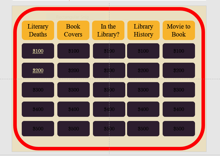
To help you visualize the problem – a picture of the game board

Each square hyperlinks to a separate slide with the question (and answer).
I felt there were a number of improvements I could do to make the presentation easier to use and maintain. I won’t go into every change today, but a couple of changes involved hyperlinks
(shortcut key Ctrl + K, if you are editing 25 hyperlinks, then the reason for using a shortcut key becomes obvious).
The first maintenance problem I ran into was that the previous designer had applied the hyperlink to both the shape AND the text on the shape (now there are 50 hyperlinks – if you are counting).

They did this for a very good reason; that the text on a hyperlinked shape does not change state like normal hyperlink does (the state change shows if the link has been visited or not).
So if the slides the shapes are linked to are reordered or edited, the links have to be painstakingly tracked down and edited and since essentially the links are layered one on top of each other it is a real pain.
I had a better plan. Move the button shapes to the Slide Master (after creating a layout designed for the Game Board slide). Then insert text placeholders (yes, 25 of them) for the dollar values. Position the placeholders over each button. No hyperlinks here.
Now moving back to the Game Board slide in Normal View, I can hyperlink the text box. Text boxes behave differently from shapes, and do change state to show the link has been visited.
Another advantage of the text placeholder is that if the user inadvertently moves the text boxes, the Reset command will snap them back into position. (A definitely plus when editing 25 text boxes).
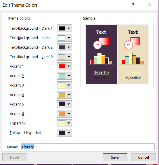
The other visual difficulty I had, was with the colours of the hyperlinks themselves. They didn’t have a strong contrast with my (new) button colour, and the visited colour was still (kinda) visible. I wanted a strong link colour and once visited I wanted the link to disappear. I could add animations, but why bother when I could solve both problems easily by changing the link colours in the Color Theme.

Here is the theme colour panel after I adjusted the Hyperlink and Followed Hyperlink Colours.
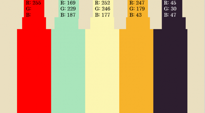
The colours in the theme were picked after playing with the free https://coolors.co/ app I also got some good advice from this article. The image at the top of the article is the colour palette created by the Coolors.co app – translated into RGB. I usually add this information as a layout in the slide master.
This post is originally from 2018 If you want help with the newest and classic features in PowerPoint drop me a line at catharine@mytechgenie.ca


One Reply to “PowerPoint Links”