
Simple or Complicated?
Simple or complicated? It’s been my observation that anyone can make a subject sound complicated – but it takes real understanding of a topic to simplify it in a way that is meaningful.
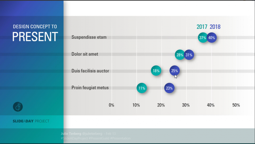
This is why, when I saw this sample slide below from designer Julie Terberg, I sat up and paid attention. Here is a wonderful example of a chart that is simple in a beautiful and useful way. Immediately, you can see that an audience would find this chart easy to read and understand
I paid even more attention when I saw the way that Neil Malek put together an Excel version of the chart. Neil introduces a clever technique using shapes in data labels.
Unfortunately, Neil’s clever technique was only available in Office 2016. I wanted to build the chart in Office 2010, for the benefit of my clients still using 2010.
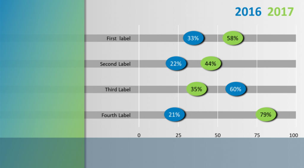
I think that in the end, I succeeded. If you are interested in building this chart, and like me you are restricted to Office 2010, then I have a few pointers for you.
Button Bar Chart Pointers
- Data Labels in 2010 can not use shapes. Instead, I tweaked the Shadow setting for the label, by setting the colour to match the fill on the label and the size to 150%. I left all other settings to zero. Shaping the label this way means that you can never achieve the circle that Julie used in her example. Instead, the best you can do is a lozenge shape. You can modify this when you change the font size in the label.
- But once you’ve used the Shadow to enlarge your button, you can’t use it to shadow the data label. I solved this problem with an old fashioned solution. I made two charts (a 2016 and a 2017 chart). The two charts are grouped together. Each chart has a data label for the year and a data label for the shadow. In the example below those labels are using the 1 values. The column labelled 2016 value is the length of the bar.
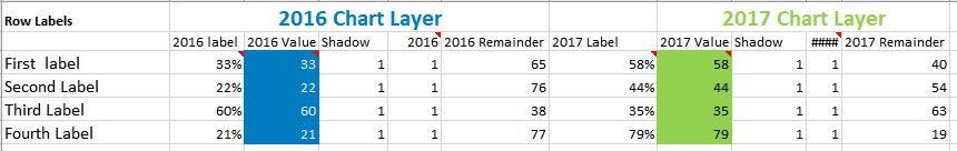
- The Shadow column must proceed the 2016 column or your shadow will wind up on top of the 2016 label. Also format your labels in that order as well, or the shadow will temporarily be on top of the 2016 label.
- Format your shadow and label to the same font size.
- The Chart Element selector on the Format Tab of the Chart Tools ribbon is your friend. Its’ really the only reasonable way to select the shadow data labels once they are under the visible label.
- Link the label text to the cell in in Excel by using the formula bar and typing in the linking formula to the cell. This allows you to update the chart, by changing the text in the cell. A bit finicky to set up; but it will save a ton of time in the long run.
- The best way to take this chart into PowerPoint is by copying/pasting the chart – as an image. Which means that you’ll need to presize the chart in Excel, so that text is not distorted by resizing once it is pasted into PowerPoint. Again, its a bit finicky – but worth it.
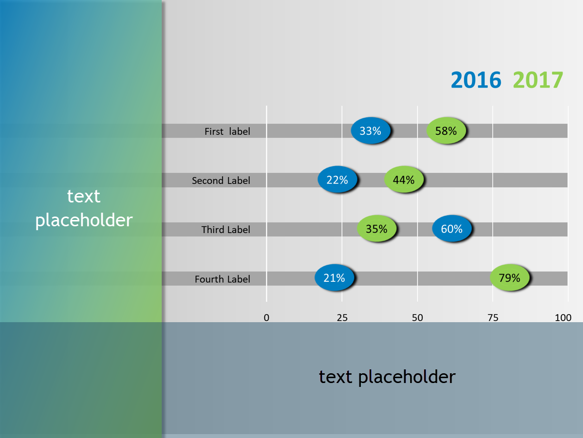
- In PowerPoint, I created a layout, with text placeholders on the left and bottom of the slide.
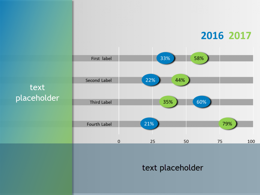
Layout has text placeholders on left and bottom of slide
All in all, a pretty reasonable version of Julie’s stellar design.
If you want to follow Julie Terberg and Neil Malek on Twitter, you’ll find them here.
This post is originally from 2018. If you want help with the newest and classic features in PowerPoint drop me a line at catharine@mytechgenie.ca
One Reply to “Button Bar Chart”