Among the many reasons I love Word Styles, is how it makes the Navigation Pane more powerful and easier to use.
Find Navigation Pane on the View Ribbon
Turn on the Navigation Pane by going to the View Tab, Show Group and checking the Navigation Pane check box.
Unformatted text on the page and in Navigation Pane
At this point, if your text is unformatted, the Navigation Pane will not look that useful. But, watch what happens when I add styles to the unformatted text.
Text Formatted with Styles appears both on the page and in the Navigation Page
Now the text appears in the Navigation Page in the same style hierarchy used in the document. Now I can use the Navigation Page to quickly move around the document by clicking on the text I want to jump to.
Text can be collapsed and expanded
If there is a lot of text, it can be collapsed and expanded using the triangle buttons.
The Navigation Pane can be used for more than navigation, it can also be used to reorder/reorganize text in the document. For example, perhaps I wish to move the section on the “The Adventures of Pinocchio” after “Aladdin”. I can do this easily by clicking on that heading in the Navigation Pane and dragging it below the heading I want it to follow.
Results of using the Navigation Pane to reorder my document
Not only is that heading moved but all the subtext beneath it is moved as well. Fast and easy document reorganization!
I offer Word template design services and training. Feel free to send me an email.
Featured image from oxana v
A few weeks ago the following request came to me: “I have also been told that there is a way to change and update several … in a bulk fashion, that would speed up the process when customizing many documents for a specific job.” Of course, I immediately started thinking about a process that would allow one to smoothly update a group of standard documents. For example; every time a new customer is being set up.
I reached for the INCLUDETEXT field in Word. In contrast to inserting a file (which takes the entire contents of a file), the INCLUDETEXT field allows you to specify text within a file, when that text has been identified by a bookmark.
The Plan
Set up a “CustomerInfo” source document. Then in my standard documents (target documents), I’d use the INCLUDETEXT field to link to the relevant pieces of information stored in the source document. Updating would be a breeze, simply change the information in the source and the next time the fields are updated in the target document all the correct information will appear. In this process, the Customer Information source document would:
Always have the same file name
Be stored in the same folder as the rest of the customer files. If this is not the case, then the field code in the target document will need to be adapted from my example.
The Source Document
Setting up the source document is pretty straightforward – I’d make a form detailing the information to be collected. However, bookmarks are too easy to delete when adding or updating information. I’d use content controls nested inside the bookmarks. This also takes advantage of tabbing from one control to another, making it faster to input and edit information. The controls can be grouped or placed in a table. But don’t use the Locking options when creating the control. Locking a control prevents the target document from updating.
The Target Document
I’d place the following field in the target document {INCLUDETEXT "{FILENAME \P}\\..\\source document filename" bookmark}
Replacing the source document filename with the Customer Information filename (including the docx extension) and the bookmark with the name of the bookmark from the source document.
The {FILENAME \P}\\..\\ portion of the field extracts the path & filename of the current file and clips off the filename (using \\..\\), which allows you to substitute the source document filename. Hat tip to MS Word MVP Paul Edstein for this clever solution.
Updating
The INCLUDETEXT field is classified as a “warm” field in Word. This means it does not update automatically, but requires user intervention. The user needs to select the field and press the F9 function key to update. If multiple fields are used in the same document, use Ctrl + A to select the entire document, then press F9 to update all fields.
There are macros to update all the fields as well, but the keyboard commands are just as straightforward. Depending on the workflow, I might write a macro to loop through all the documents in a folder and force updating.
I offer Word template design services and training. Feel free to send me an email.
Here is a scenario: A running total of numbers, updated daily. You want to capture the previous day’s total, as you can see in the picture below.
Looking for the Previous Day’s total in a column of numbers
I’m showing the answer in two steps here, in real life I’d make it into one formula.
The first step is to capture the row number of the previous day’s total. Finding it using the numbers in Column C would be way too complicated. But Column B has the kind of data we can use.
Using the formula =LOOKUP(2,1/(B2:B29<>0),ROW(B:B)) captures the row.
Finding the row number for the previous day’s value.
What the lookup formula is doing is starting by evaluating the numbers from B2:B29 looking for values that aren’t equal to zero.
This creates an array like this: {TRUE;TRUE;TRUE;TRUE;TRUE;TRUE;TRUE;TRUE;TRUE;TRUE;TRUE;TRUE;TRUE;TRUE;FALSE;FALSE;FALSE;FALSE;FALSE;FALSE;FALSE;FALSE;FALSE;FALSE;FALSE;FALSE;FALSE;FALSE}
The TRUE values will equal 1 and the FALSE values equal 0.
This means when the formula divides 1 by those values, an array looking like this is created:
{1;1;1;1;1;1;1;1;1;1;1;1;1;1;#DIV/0!;#DIV/0!;#DIV/0!;#DIV/0!;#DIV/0!;#DIV/0!;#DIV/0!;#DIV/0!;#DIV/0!;#DIV/0!;#DIV/0!;#DIV/0!;#DIV/0!;#DIV/0!}
Lookup can’t find 2 in the array, so it settles for the largest value in the array that is less than or equal to lookup_value.The ROW function tells it to return the row number from the array B2:B29.
The second step is to combine the row number with the column number and show the result using =INDIRECT("C"&D2)
And there you have it. A quick way of always finding the previous day (month, year, whatever).
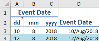
Passing a spreadsheet around between organizations has a hidden problem; one that can easily make trouble. And the trouble comes, not from the spreadsheet, but from the default date setting on the computer.
Excel uses the default date setting to interpret the order of date information. Whether its’ Month-Day-Year or Day-Month-Year, or even Year-Month-Day, that information comes from the OS date settings. These are settings that we don’t often think about once we’ve set them. And typically, they are the same throughout an organization.
But take the spreadsheet you’ve designed, that uses Month-Day-Year into a Day-Month-Year organization, and all sorts of problems crop up.
The first problem is that you might not notice immediately; if July 6, turns into June 7 – that might not jump out at you as a problem. If you are lucky, you’ll spot something weird about the 12th of Month 21 …
So how do you nail down those dates so they can’t shift? One strategy is to break up your date entry into your preferred format, and then rebuild the date using the DATE function.
The syntax for the DATE function is =DATE(year, month, day)
Using the Date function to reassemble a date from separate cells
Here you can see the DATE function is building a date from the values in three separate cells: A3, B3 and C3 and the formula looks like this =DATE($C3,$B3,$A3)
Another advantage of this strategy is that Data Validation can be applied to these cells; ie the day column can be restricted to whole numbers between 1 and 31, the month column to whole numbers between 1 and 12 and the year column as well. In the sample file I’m using, the column holding the complete date (D) is hidden from the user. They will only see columns A thru C. The complete (and correct) date is referenced in formulas.
An alternate strategy would be to use the DATE function to extract the correct order from a whole date typed into a cell. In this case you would need to rely on the users to enter the date consistently regardless of their date system. I would recommend a custom date format be applied and a comment to tell the user what the required date format is. Breaking the date up avoids this reliance on the user’s compliance.
I’ve been showing you how to use PowerPoint to quickly create stencil and lace effects. Now, let’s look at creating duotone photos. In addition to making a photo look very modern, duotone is a useful technique for using less than stellar photos.
Cat in the Kitchen
While the cat might be photogenic, the background is not. I want to move from the photo above to the duotone below, which is suitable for adding a quote.
So true
The first step is to crop the picture as closely as possible.
Just the handsome face here – no clutter
But unfortunately, once enlarged you see the photo is a little blurry. This won’t be a problem going forward and it shows how this technique can cope with less than perfect photos.
Going to Picture Corrections: Brightnesswas set to 65% Contrastto 100%
Picture Color: Saturationwas set to zero.
The Adjusted Photo
There is a bit of guesswork here, as I had to bring up Brightness enough to wash out the dark corner of the chair the cat is on, yet leave as much detail as possible. You’ll note that this brings out a lot of light spots on the pupils as well.
Why not just Recolorthe picture to Black and White? In this case, I felt that recoloring removed too much detail from the photo. In the case of a different photo, recoloring might be the quickest and easiest method. I’d definitely try it first and see if I liked the results.
I’ve drawn a rectangle and filled it with a bright colour for contrast, this has been placed under the photo.
Now I can make the white portion of the photo transparent, by selecting Picture Tools>Format>Color>Set Transparent Color and clicking on a white portion of the picture.
The black portion of the photo remains.
What’s also hard to see in the above picture is that the photo has a lot of small grey artifacts in the borders of the fur. This is exactly what we added in when making the lace picture earlier, but here it is unwanted. An additional step is required for this photo (again for some photos it might be unnecessary).
But before I do that – I’m going to use the Ink command and touch up the pupils to remove some of the glints. Ink is only available in Office 365.
Showing Glint repair using ink tool.
After filling in the glints on the pupils, I grouped the ink layer with the photo. Then I copied and pasted the photo (and ink layer) as a picture. PowerPoint remembers all the photo editing done to a picture (which is why the Reset command works) and applies those steps cumulatively. I want to start fresh and apply the Recolor command to strip out the grey artifacts without losing a lot of detail. After recoloring the photo to 25% Black and White I set the White color to transparent
The same photo, but now with a crisper look
Again, I grouped the photo with bright background rectangle, pasted it as a picture and this time set the black portion as transparent. This is similar to the photo stencil.
Photo with transparent cat
In the final step, set a gradient fill in your chosen colour scheme to colour the duotone.
Setting the background of the slide to colour the duotone
The main elements of this technique are applicable to a number of photo effects. Try them out and see what you get!
This post is originally from 2018 If you want help with the newest and classic features in PowerPoint drop me a line at catharine@mytechgenie.ca
In a previous post, I discussed making a Button Bar Chart. That whole process really inspired me to think about simplified charts for presentations.
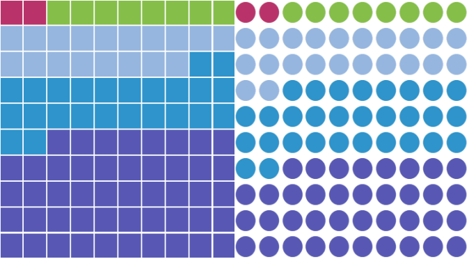
Which got me thinking about Waffle Charts.
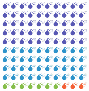
Note how the smallest group stands out
Waffle charts are excellent for looking at data sets where the smallest numbers are the important ones. You can use colour (as I have above) to make those numbers stand out.
But oddly, I don’t see people using a lot of waffle charts in their presentations. And there is no template for a waffle chart in Excel.
You can find some interesting ideas about building Excel waffle charts for dashboard purposes and I recommend this article to you: Interactive Waffle Charts in Excel
However, I was looking for something different. Something that wouldn’t have me counting and colouring cells manually (shudder).
Building the Waffle
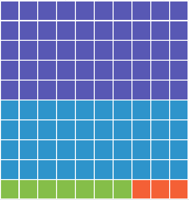
I chose to build the waffle chart using a series of conditional formatting rules. The first step was creating the formula to count the cells of the waffle.
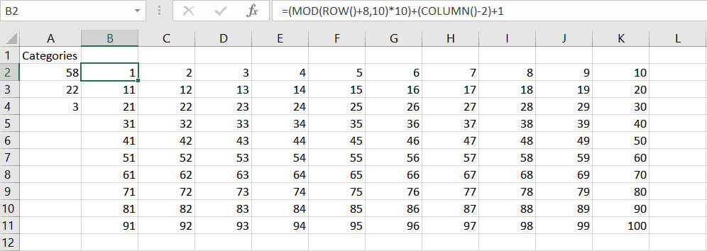
Counting the cells in a 100 grid waffle
In case the picture is a bit small, the formula used here is:
=(MOD(ROW()+8,10)*10)+(COLUMN()-2)+1
This uses the row and column position of the cell to count from 1 to 100 in a 10 by 10 grid.
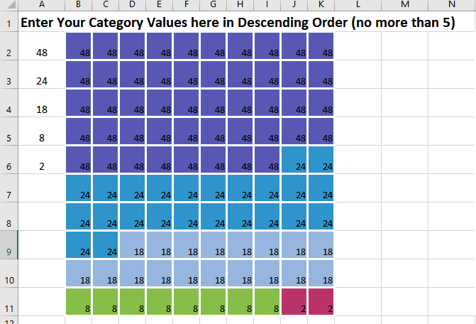
I then built on that base formula with this monster formula:
The formula checks the position number of the cell generated by the base formula and sees if it is less than or equal to the number of values in each category in column A. It then returns the value of the category in each cell.
Because I wanted to put symbols in the cell like these examples.
Talking Heads waffle chartBombs waffle chart
I took that monster formula and made it into a named formula.
This made building the conditional formatting rules much easier to do(simply because the conditional formatting dialog is so cramped).
Lastly, I built a series of conditional formatting rules to change the background colour of the cell based on the value returned by the formula. For the waffles using symbols, the rule formats the colour of the font, instead of the background.
A couple of additional pointers
To create a perfect grid, switch the view in Excel to Page Layout View. Page Layout View uses the same measurement scale for both row height and column width. Set your measurements here.
For the symbol waffles, use the File> Options>Advanced> Display Options for this worksheetand turn off the display of gridlines. That way when you copy the waffle, the gridlines will be invisible.
This post is originally from 2018. If you want help with the newest and classic features in Excel & PowerPoint drop me a line at catharine@mytechgenie.ca
Simple or complicated? It’s been my observation that anyone can make a subject sound complicated – but it takes real understanding of a topic to simplify it in a way that is meaningful.
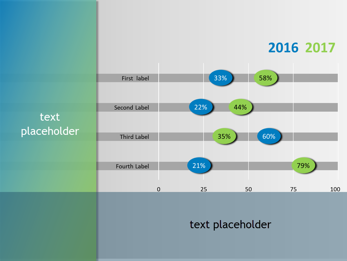
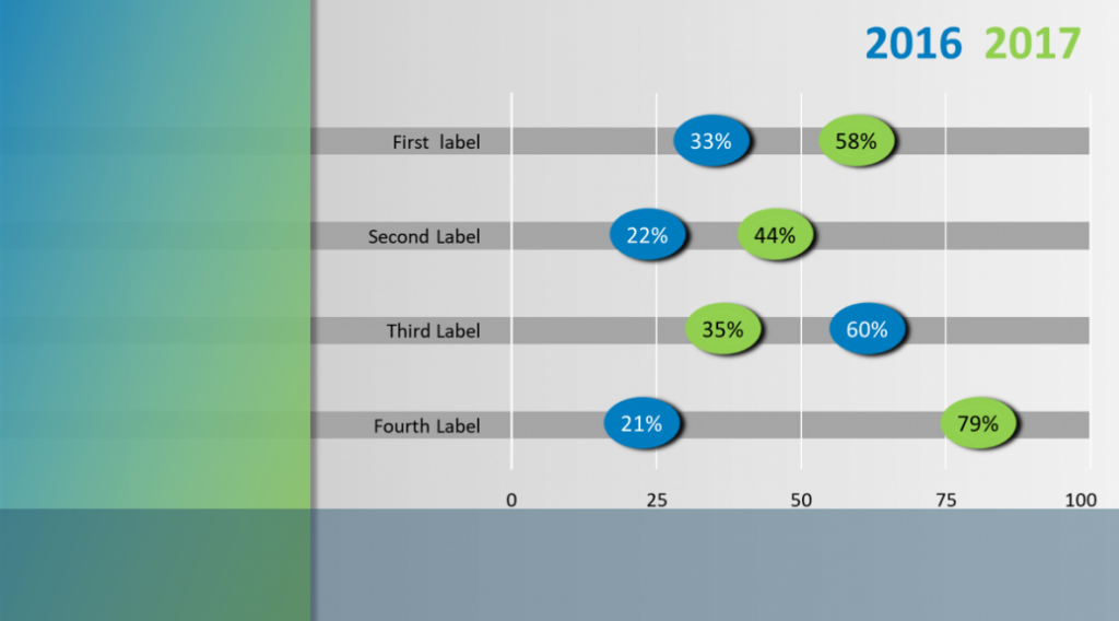
This is why, when I saw this sample slide below from designer Julie Terberg, I sat up and paid attention. Here is a wonderful example of a chart that is simple in a beautiful and useful way. Immediately, you can see that an audience would find this chart easy to read and understand
Julie Terberg’s Button Bar Chart from her #SlideADayProject project
I paid even more attention when I saw the way that Neil Malek put together an Excel version of the chart. Neil introduces a clever technique using shapes in data labels.
Unfortunately, Neil’s clever technique was only available in Office 2016. I wanted to build the chart in Office 2010, for the benefit of my clients still using 2010.
Button Bar Chart Slide, in PowerPoint 2010
I think that in the end, I succeeded. If you are interested in building this chart, and like me you are restricted to Office 2010, then I have a few pointers for you.
Button Bar Chart Pointers
Data Labels in 2010 can not use shapes. Instead, I tweaked the Shadow setting for the label, by setting the colour to match the fill on the label and the size to 150%. I left all other settings to zero. Shaping the label this way means that you can never achieve the circle that Julie used in her example. Instead, the best you can do is a lozenge shape. You can modify this when you change the font size in the label.
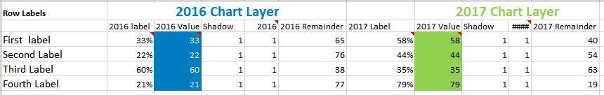
But once you’ve used the Shadow to enlarge your button, you can’t use it to shadow the data label. I solved this problem with an old fashioned solution. I made two charts (a 2016 and a 2017 chart). The two charts are grouped together. Each chart has a data label for the year and a data label for the shadow. In the example below those labels are using the 1 values. The column labelled 2016 value is the length of the bar.
Button Bar Chart Data layout
The Shadow column must proceed the 2016 column or your shadow will wind up on top of the 2016 label. Also format your labels in that order as well, or the shadow will temporarily be on top of the 2016 label.
Format your shadow and label to the same font size.
The Chart Element selector on the Format Tab of the Chart Tools ribbon is your friend. Its’ really the only reasonable way to select the shadow data labels once they are under the visible label.
Link the label text to the cell in in Excel by using the formula bar and typing in the linking formula to the cell. This allows you to update the chart, by changing the text in the cell. A bit finicky to set up; but it will save a ton of time in the long run.
The best way to take this chart into PowerPoint is by copying/pasting the chart – as an image. Which means that you’ll need to presize the chart in Excel, so that text is not distorted by resizing once it is pasted into PowerPoint. Again, its a bit finicky – but worth it.
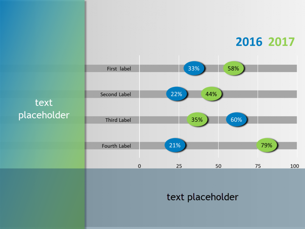
In PowerPoint, I created a layout, with text placeholders on the left and bottom of the slide.
Layout has text placeholders on left and bottom of slide
All in all, a pretty reasonable version of Julie’s stellar design.
If you want to follow Julie Terberg and Neil Malek on Twitter, you’ll find them here.
In my last post, I mentioned I was working on a Jeopardy game in PowerPoint. In this game I want to present a series of visual clues before the answer is revealed. The audience is presented with the foreign cover for a popular book and has to guess the name of the book.
Can you guess the book, by seeing its foreign (Greek) version cover?
I want to slowly reveal the English book cover, by gradually making the foreign cover more transparent. With this particular cover, I also wanted to crop the foreign cover image to reveal additional clues. Each clue will be revealed by a click of the mouse.
Hmm is this a problem? I can not control image transparency in PowerPoint, there is no option for this in the Picture Toolsmenu.
Nope, no problem at all. You can control image transparency by:
Create a shape the same dimensions as your picture.
Remove the outline for the shape.
Change the fill option to Picture or Texture Fill and insert the picture file.
Transparency will now be available
Its’ interesting that placing a picture inside a shape allows you to manipulate that picture as if it was a shape. This concept allows me to play with things like irregularly shaped (non-rectangular) images as well.
This post is originally from 2018, looking at PowerPoint 2016. Our options for pictures and transparency have improved since then.
If you want help with the newest and classic features in PowerPoint drop me a line at catharine@mytechgenie.ca
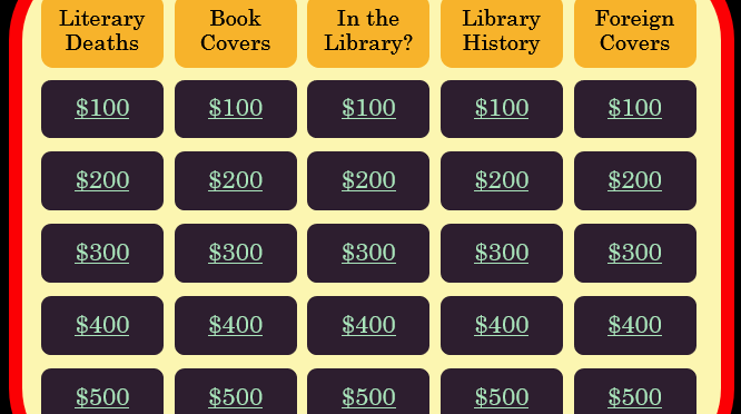
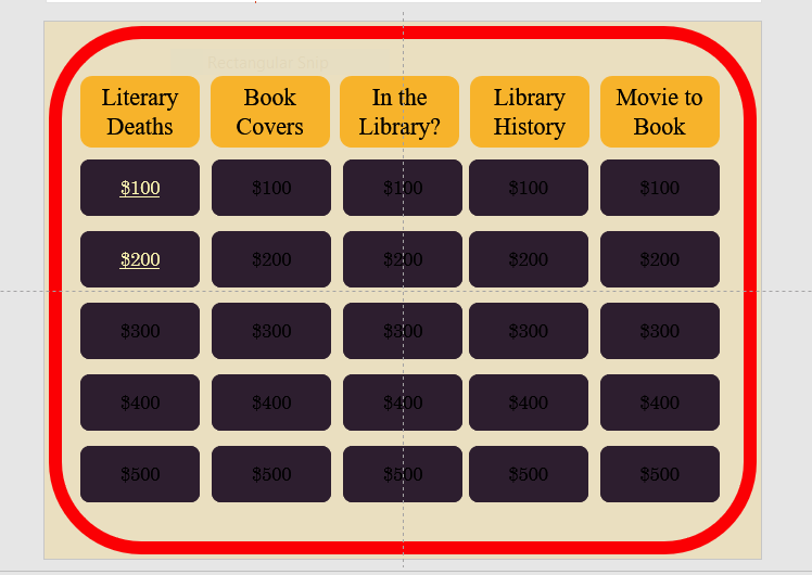
I’ve just been working on a PowerPoint template for a Jeopardy style game. I inherited this template, and as frequently happens a little cleanup is necessary to ensure the PowerPoint template works as desired.
To help you visualize the problem – a picture of the game board
The Game Board
Each square hyperlinks to a separate slide with the question (and answer).
I felt there were a number of improvements I could do to make the presentation easier to use and maintain. I won’t go into every change today, but a couple of changes involved hyperlinks
(shortcut key Ctrl + K, if you are editing 25 hyperlinks, then the reason for using a shortcut key becomes obvious).
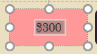
The first maintenance problem I ran into was that the previous designer had applied the hyperlink to both the shape ANDthe text on the shape (now there are 50 hyperlinks – if you are counting).
Shape with text on top
They did this for a very good reason; that the text on a hyperlinked shape does not change state like normal hyperlink does (the state change shows if the link has been visited or not).
So if the slides the shapes are linked to are reordered or edited, the links have to be painstakingly tracked down and edited and since essentially the links are layered one on top of each other it is a real pain.
I had a better plan. Move the button shapes to the Slide Master (after creating a layout designed for the Game Board slide). Then insert text placeholders (yes, 25 of them) for the dollar values. Position the placeholders over each button. No hyperlinks here.
Now moving back to the Game Board slide in Normal View, I can hyperlink the text box. Text boxes behave differently from shapes, and do change state to show the link has been visited.
Another advantage of the text placeholder is that if the user inadvertently moves the text boxes, the Reset command will snap them back into position. (A definitely plus when editing 25 text boxes).
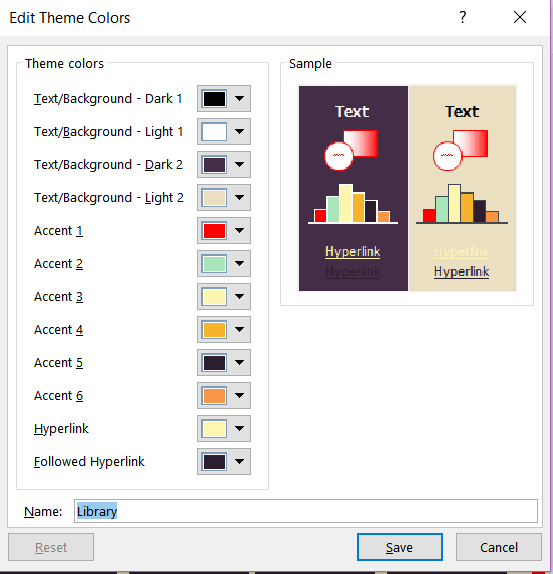
The other visual difficulty I had, was with the colours of the hyperlinks themselves. They didn’t have a strong contrast with my (new) button colour, and the visited colour was still (kinda) visible. I wanted a strong link colour and once visited I wanted the link to disappear. I could add animations, but why bother when I could solve both problems easily by changing the link colours in the Color Theme.
Theme Colour Panel PowerPoint 2016
Here is the theme colour panel after I adjusted the Hyperlink and Followed Hyperlink Colours.
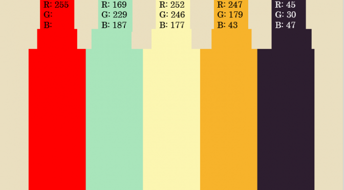
The colours in the theme were picked after playing with the free https://coolors.co/ app I also got some good advice from this article. The image at the top of the article is the colour palette created by the Coolors.co app – translated into RGB. I usually add this information as a layout in the slide master.
This post is originally from 2018 If you want help with the newest and classic features in PowerPoint drop me a line at catharine@mytechgenie.ca