
As you might have noticed – I have a book out!
But how did I design the cover? Well, I think its’ kind of an interesting story.
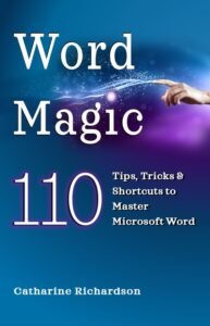
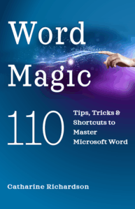
My first cover looked like this:
Now, this cover is quite different from a “standard” computer manual cover. It has a serif font, a different style of image (a burst of “black magic” with sparkles) and a solid intense colour on the cover. I wanted the book to look different, because I’m trying to reach a different audience. I’m looking for readers who would normally not be attracted or interested in reading a hefty user manual. Word Magic is a short (150 pages), paperback sized, fast read. I wanted it to look different from the beginning.
In my reading I ran across Dave Chesson, the “Kindlepreneur” and he recommended a service called Pick.Fu which provides A/B testing.
So I started by asking what people thought of this cover. And the results, were not what I thought they would be.
“Change whatever the object is behind the words. Its confusing and dark and I dont like it.”
“I like that the text is the focal point and easy to read. If possible I would change the image in the background because I’m not sure what it is.”
Interesting, because my family and friends liked the cover.
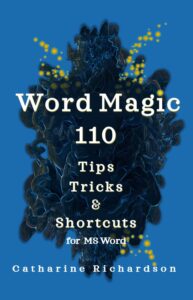
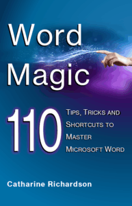
So I asked a family friend to design an alternate cover and she came up with this lovely clean design (and changed the title in a powerful way).
And then went back to Pick.Fu and ran a poll comparing them.
The new design won by two votes and the comments about the old design continued to criticize the graphic. Clearly, it wasn’t communicating “magic” to the audience. My family and friends liked it because I had explained it to them.
But, I was still committed to my concept of a non-standard looking computer book. I also wasn’t keen on a white cover, as that doesn’t stand out as much in a small thumbnail view that is used on Amazon/Kobo.
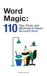
So I went back to the drawing board and came up with two new options.
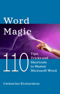
I ran a third poll comparing the three covers, and this time the white cover and the magic swirl design were tied.
But again, the comments were the useful element here.
“the worker bee is more interesting to me than the freaky finger”
“(Option) C looks the most magic and cool to me”
“It’s the design of choice C that’s drawing me into want to learn more about what this book or product is and then choice B is my second pick .”
Overall, the comments for the magic swirl were more positive even though the votes tied.
But, just to be sure. I ran a final poll comparing a serif font vs a sans serif font – just to make sure I wasn’t being too stubborn.
The serif font (and the decorative dot on the i) won the final poll.
It was a very interesting journey to the final product.