This is a reissue of an article I originally posted on March 7, 2019 on the WebGenii Consulting website. I think it will continue to be relevant for some time to come.
Last weekend I attended the Southern Alberta Library Conference. I really enjoy this conference, the speakers are great and the topics really relevant to my volunteer work with the Redcliff Public Library. So what does this have to do with presentation mistakes? It was interesting to see the kind of presentation mistakes that speakers who are good at presenting make.
Mistake Number 1
Our old friend – too much text on the slide. Even good speakers do this, even though they shouldn’t. I suspect because they worry about leaving something out of their presentation.

Once again, I’d like to join my voice to all the presentation experts telling you NOT to put all your text on the slide. But, I know it will happen anyway, so what can we do to improve a slide like this?
Remove Bullets

If you are going to write full sentences with punctuation, then bullets are completely unnecessary. They take the viewer’s eye away from the content of the sentence. Save bullet points for sentence fragments, which is what they are designed for.
One Sentence Per Slide

Help the audience focus its’ attention by restricting yourself to one sentence per slide at a time.
Position Sentence Text

There is no rule in PowerPoint (or any presentation software) that requires you to use the default text wrapping. Add line breaks to force text to wrap for greater readability and easier recall. Notice how the ham jumps out from the rest of the text, when it is forced onto its’ own line. Think about the part of the sentence you wish to emphasize and add line breaks accordingly. Also, if the sentence is on its’ own slide, there will be room to do this.
Mistake Number 2
Smart Art can cause problems of its’ own. In particular, the seductive way it shrinks text to fit into the graphic makes people forget to edit. (See mistake number 1)

Also, the default colour schemes means a lovely rainbow of colours. How is this a bad thing you ask? Well, inevitably you get a colour combination like point three in the graphic above. White text on a yellow background. That’s readable on a computer monitor, but when projected onto a screen it doesn’t have enough contrast.
The rainbow effect above, does something else as well. It wastes the potential usefulness of those colours. Colour is a great way of adding organization and hierarchy to a presentation. In the slide above, perhaps green refers to free-range meat, blue to fish, yellow to poultry, red to spicy foods, and I have no idea what pink would refer to. Because there is no organization being used here, just the random default applied by Smart Art.
Ignoring the organizational impact of colour, is like leaving money on the table.
Mistake Number 3
This last mistake is a little bit of mistake 1 AND mistake 2 combined, and it comes from using Smart Art process graphics like the one below:

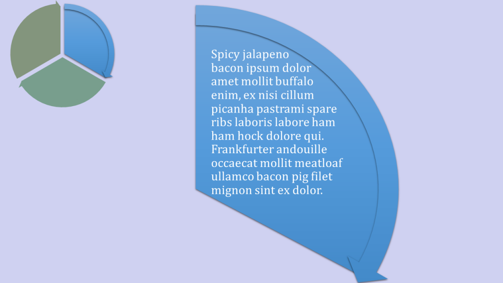
Every time, a process graphic like this leads to the speaker saying “I know this is hard to read, but”. Hmmm, yes it IS hard to read, but I can understand the desire to help people understand the flow of a process. So why not introduce your process in a series of slides like this:

In this sample slide I’ve taken the process and reduced to a smaller graphic in the top left corner. Here it will act as a map to show people where we are. I’ve toned down the colours of the steps that are not being talked about on this slide. I’ve left the bright blue alone, because we are talking about the blue step on this slide. I’ve cut out the blue step and enlarged it, so the text will be easier to read. It is easy to imagine each step in turn being featured on a separate slide and highlighted on the map.
Once again, thanks to everyone who spoke at the Southern Alberta Library Conference. I learn a lot about how to be a better library board member every time I attend. And, if you are a resident of Alberta; consider volunteering in your local library. It really is the best volunteer gig around. Such a positive environment that really makes a difference in the community!
I offer presentation design services and coaching. Feel free to send me an email.
My updated (November 2019) email address is: catharine@mytechgenie.ca

