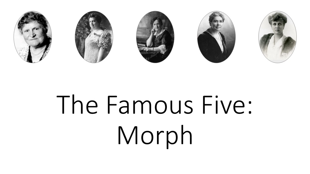
I find it useful when creating a presentation that has a custom colour palette to create a custom layout like the one below:
Colour Palette Assignment Slide Layout – accessible via Master view, or by selecting the layout
You’ll note that the RGB values for the colours are listed, and this is because prior to PowerPoint 2013, the eyedropper tool was not available. I also find it tremendously helpful to note what I use each colour for, so that when I open this file in a couple of years from now there will be a little less detective work.
This post is originally from 2018 If you want help with the newest and classic features in PowerPoint drop me a line at catharine@mytechgenie.ca
I’ve just been working on a PowerPoint template for a Jeopardy style game. I inherited this template, and as frequently happens a little cleanup is necessary to ensure the PowerPoint template works as desired.
To help you visualize the problem – a picture of the game board
The Game Board
Each square hyperlinks to a separate slide with the question (and answer).
I felt there were a number of improvements I could do to make the presentation easier to use and maintain. I won’t go into every change today, but a couple of changes involved hyperlinks
(shortcut key Ctrl + K, if you are editing 25 hyperlinks, then the reason for using a shortcut key becomes obvious).
The first maintenance problem I ran into was that the previous designer had applied the hyperlink to both the shape ANDthe text on the shape (now there are 50 hyperlinks – if you are counting).
Shape with text on top
They did this for a very good reason; that the text on a hyperlinked shape does not change state like normal hyperlink does (the state change shows if the link has been visited or not).
So if the slides the shapes are linked to are reordered or edited, the links have to be painstakingly tracked down and edited and since essentially the links are layered one on top of each other it is a real pain.
I had a better plan. Move the button shapes to the Slide Master (after creating a layout designed for the Game Board slide). Then insert text placeholders (yes, 25 of them) for the dollar values. Position the placeholders over each button. No hyperlinks here.
Now moving back to the Game Board slide in Normal View, I can hyperlink the text box. Text boxes behave differently from shapes, and do change state to show the link has been visited.
Another advantage of the text placeholder is that if the user inadvertently moves the text boxes, the Reset command will snap them back into position. (A definitely plus when editing 25 text boxes).
The other visual difficulty I had, was with the colours of the hyperlinks themselves. They didn’t have a strong contrast with my (new) button colour, and the visited colour was still (kinda) visible. I wanted a strong link colour and once visited I wanted the link to disappear. I could add animations, but why bother when I could solve both problems easily by changing the link colours in the Color Theme.
Theme Colour Panel PowerPoint 2016
Here is the theme colour panel after I adjusted the Hyperlink and Followed Hyperlink Colours.
The colours in the theme were picked after playing with the free https://coolors.co/ app I also got some good advice from this article. The image at the top of the article is the colour palette created by the Coolors.co app – translated into RGB. I usually add this information as a layout in the slide master.
This post is originally from 2018 If you want help with the newest and classic features in PowerPoint drop me a line at catharine@mytechgenie.ca
Join me in this webinar, hosted by the Medicine Hat Chamber of Commerce
There’s been a lot of talk lately about “Zoom Fatigue”. The trailer above is one way to combat fatigue. Creating trailers for your presentations allow you to shorten the presentation by introducing information ahead of time. Like a movie trailer; your talk trailer tells your audience what to expect and allows you to cut your talk time down.
And why limit yourself to a single trailer? For longer and more complex materials, you might want to create multiple trailers that can prepare your audience properly for your talk.
Creating your trailer in PowerPoint allows you to easily reuse elements in future trailers. This saves time and strengthens your brand presence. You can bet I’ll be reusingthe little animated stars on this slide that act as an attention getter for keywords.
These little purple star animations pull the eye to key words
Like the idea of saving time? Drop me a line, and lets’ make something fantastic for your next presentation. A reusablesomething fantastic!
Normally, people save their PowerPoint presentations in the default format. However, once you are on the final version of you presentation consider using the PowerPoint Show format. Saving your PowerPoint presentation as a show is easy. Use the Save As command and use the Save As Type list to show all the possibilities. Select PowerPoint Show and save as normal.
PowerPoint 2010 Save as Dialog. Not many changes here.
The screen shot above is from PowerPoint 2010, but you should see a similar list in subsequent versions. The show will be saved in a different file format, using the .ppsx or .pps file extension.
The result is a change in behaviour when the file is opened. Double-click on the file and it will launch immediately into Slide Show view. Much slicker than starting the presentation, allowing the audience to view your notes, finding the slide show icon and starting the presentation. If you have a presentation that uses timed transitions and you are worried about the presentation running away on you, remove the timing from the first slide. Use a mouse click to advance to the rest of your timed slides once you are ready to start. I think you’ll find this a smoother way of launching your presentation.
If you need to edit your presentation, start PowerPoint and use it to open the show. You can edit the file as you would normally. If you wish to convert it back to a regular presentation, use the Save As command and save it in the normal file format.
I help people create dynamite presentations. Drop me an email at catharine@mytechgenie.ca and we can do amazing things!
Faced with designing a PowerPoint presentation and you don’t know where to begin? Try using LATCH to organize your material. First proposed by Richard S. Wurman (who also founded TED); LATCH offers a method of organizing your information. LATCH is an acronym that stands for; Location, Alphabetically, Time, Category, Hierarchy. Mr. Wurman’s brilliantly simple idea is that all information can be organized using one of these frameworks.
Some examples of LATCH are useful:
Organizing by LOCATION:
Maps
Diagrams; for example an anatomy diagram labeling parts of the body.
Organizing ALPHABETICALLY:
Telephone books
Filing systems
Indexes
Organizing by TIME:
Schedules (for example, a bus schedule)
A manufacturing process
Historical information
Organize by CATEGORY:
Retail stores organize their goods by category
Libraries separate their books into Fiction, Non-Fiction and other categories
Some kinds of information can be organized using more than one of these methods. For example a bus schedule is better understood if a map accompanies it. As the author of a presentation it is your job to figure out which method is best for your presentation or if multiple methods would bring greater clarity.
Using LATCH can help the presentation flow better and it can also help users recall more information, more effectively. Psychological studies have determined that when presented with a list of information, people can remember roughly 7 items (plus or minus 2 †). And that the longer the list is, the better chance people have of forgetting everything. So if you have 12 things to tell people, how can you help them remember?
When people have longer pieces of information to remember, they divide that information into “chunks“ that are easier to remember. Think about the telephone number 867-5309 ‡. If you are trying to memorize that number, is it easier to remember?
8
6
7
5
3
0
9 Or
867
5309
By “chunking” the number you reduce a longer list into 2 items.
When my husband was in university he enrolled in a course that he wasn’t really looking forward to – “The Biology of Invertebrate Animals”, because he knew that there would be a lot of memorization. But his professor did something interesting; at the end of discussing each animal, he would talk jokingly about how they would cook that animal in China (he was Chinese). The humour helped of course, but he was also categorizing the animals in an interesting way “Animals We Eat” vs. “Animal We Don’t Eat”.
In some ways, this categorization was completely artificial – students weren’t tested on Chinese recipes after all. But usefully, it provided an interesting category system that helped students to “chunk” the information and retain it. Even now, many years later, my husband can recall invertebrate information because of this categorization system.
By organizing your information using LATCH, you help your audience group it into meaningful chunks, so they will retain more information.
I have slightly updated this post from when I first published it in 2015. If you need help creating your next presentation, email me at catharine@mytechgenie.ca or join me Friday, June 5/2020 from 9am – 12pm at Medicine Hat College for Plot A Great Talk, a 3 hour seminar dedicated to helping you create your best ever presentation. Here’s the Medicine Hat College Continuing Studies registration link.
This is a reissue of an article I originally posted on March 7, 2019 on the WebGenii Consulting website. I think it will continue to be relevant for some time to come.
Last weekend I attended the Southern Alberta Library Conference. I really enjoy this conference, the speakers are great and the topics really relevant to my volunteer work with the Redcliff Public Library. So what does this have to do with presentation mistakes? It was interesting to see the kind of presentation mistakes that speakers who are good at presenting make.
Mistake Number 1
Our old friend – too much text on the slide. Even good speakers do this, even though they shouldn’t. I suspect because they worry about leaving something out of their presentation.
All the text, nothing missing. (Dummy text courtesy the Bacon Ipsum generator)
Once again, I’d like to join my voice to all the presentation experts telling you NOT to put all your text on the slide. But, I know it will happen anyway, so what can we do to improve a slide like this?
Remove Bullets
Same slide – fewer bullets
If you are going to write full sentences with punctuation, then bullets are completely unnecessary. They take the viewer’s eye away from the content of the sentence. Save bullet points for sentence fragments, which is what they are designed for.
One Sentence Per Slide
Give each Sentence its’ own slide
Help the audience focus its’ attention by restricting yourself to one sentence per slide at a time.
Position Sentence Text
Control text wrapping to effectively position your message
There is no rule in PowerPoint (or any presentation software) that requires you to use the default text wrapping. Add line breaks to force text to wrap for greater readability and easier recall. Notice how the ham jumps out from the rest of the text, when it is forced onto its’ own line. Think about the part of the sentence you wish to emphasize and add line breaks accordingly. Also, if the sentence is on its’ own slide, there will be room to do this.
Mistake Number 2
Smart Art can cause problems of its’ own. In particular, the seductive way it shrinks text to fit into the graphic makes people forget to edit. (See mistake number 1)
Smart Art isn’t as smart as you think
Also, the default colour schemes means a lovely rainbow of colours. How is this a bad thing you ask? Well, inevitably you get a colour combination like point three in the graphic above. White text on a yellow background. That’s readable on a computer monitor, but when projected onto a screen it doesn’t have enough contrast.
The rainbow effect above, does something else as well. It wastes the potential usefulness of those colours. Colour is a great way of adding organization and hierarchy to a presentation. In the slide above, perhaps green refers to free-range meat, blue to fish, yellow to poultry, red to spicy foods, and I have no idea what pink would refer to. Because there is no organization being used here, just the random default applied by Smart Art.
Ignoring the organizational impact of colour, is like leaving money on the table.
Mistake Number 3
This last mistake is a little bit of mistake 1 AND mistake 2 combined, and it comes from using Smart Art process graphics like the one below:
Here is a process with multiple steps and a lot of text.
Every time, a process graphic like this leads to the speaker saying “I know this is hard to read, but”. Hmmm, yes it IS hard to read, but I can understand the desire to help people understand the flow of a process. So why not introduce your process in a series of slides like this:
Introduce your process in a series of slides.
In this sample slide I’ve taken the process and reduced to a smaller graphic in the top left corner. Here it will act as a map to show people where we are. I’ve toned down the colours of the steps that are not being talked about on this slide. I’ve left the bright blue alone, because we are talking about the blue step on this slide. I’ve cut out the blue step and enlarged it, so the text will be easier to read. It is easy to imagine each step in turn being featured on a separate slide and highlighted on the map.
Once again, thanks to everyone who spoke at the Southern Alberta Library Conference. I learn a lot about how to be a better library board member every time I attend. And, if you are a resident of Alberta; consider volunteering in your local library. It really is the best volunteer gig around. Such a positive environment that really makes a difference in the community!
I offer presentation design services and coaching. Feel free to send me an email.
My updated (November 2019) email address is: catharine@mytechgenie.ca