A Spreadsheet is Creative – Part 1

Creating a spreadsheet is a creative act. The choices made about data, formulas, layout and colour all contribute to communicating clearly. Communicating clearly and well is, in my book a creative process.

So, I thought I’d walk through my process in designing a spreadsheet to take information from what is essentially a database layout:

This database view works fine for an Excel Nerd like me.

Into this view, a classic calendar view of the same information:

A weekly calendar view of the same information.

I’m planning to use the calendar view to share a social media posting schedule, as the people I’m sharing with aren’t Excel savvy (and why should they be?). I create the posting schedule in Excel, because I can easily save it in .csv format and upload it to Google Calendar. However, sharing the Google Calendar has drawbacks too, and it is simpler to print out a weekly calendar showing the planned posts.
When I began this process, I had some things sketched out in my mind. I wanted to enter a date and see the week around it. I always want to see the posts for the date in the context of the posts for the days around it. I also want a consistent layout of days – Sunday to Monday. Having the starting day of the week change each time would make it harder for my viewers.
That means I’m going to need to dynamically generate the dates based on the day of the week of my starting date. You can see my first pass below:

Dynamically generating the date based on the day of the week

I labelled cell A1 WeekStart, this will help me remember the purpose of the contents of cell A1.
I’ve labelled the days of the week, and above them in row 2, given each day a number 1-7. The day numbers relate to the way the WEEKDAY function works. I’ll be using the mode where the week starts numbering 1 on Sunday. Later I’ll hide that row, but for now having it visible is helpful.
You can see that I’m stepping out the formula in rows 4 – 6. When I’m designing a spreadsheet, I’ll often step formulas out like this. It helps me avoid errors and makes each step clear. Later I’ll consolidate the steps.
In row 4, I’m calculating the following:
=(WEEKDAY(WeekStart,1))-B$2.
You can think of it as a way to calculate the number of days (+/-) from my start date. By the way, I chose to start with May 1, because it was on a Wednesday. That made sure I could test my formulas well, a Saturday or Sunday starting day would make testing harder.
Once I know I can count backwards and forwards from my starting date, I use the following formula:
=WeekStart-((WEEKDAY(WeekStart,1))-B$2)
The WEEKDAY function calculates the day number of the week. Here, it returns the number 4(Wednesday).
From the number 4 I subtract the value in row 2. This gives me the number of days to subtract from the WeekStart value. You can see the results in rows 5 and 6. Row 5 is simply the unformatted date value, since sometime I find visualizing the pure number easier.

This turned out to be a 5 part series! I hope you’ll find the next 4 parts interesting.

I’ll continue with the design process in my next post.


I offer Excel template design services and training. Feel free to send me an email – catharine@mytechgenie.ca

Headline Photo by Estée Janssens on Unsplash

Duotone Photo Technique

Duotone Photos

I’ve been showing you how to use PowerPoint to quickly create stencil and lace effects. Now, let’s look at creating duotone photos. In addition to making a photo look very modern, duotone is a useful technique for using less than stellar photos.

Cat in the Kitchen

While the cat might be photogenic, the background is not. I want to move from the photo above to the duotone below, which is suitable for adding a quote.

So true

The first step is to crop the picture as closely as possible.

Just the handsome face here – no clutter

But unfortunately, once enlarged you see the photo is a little blurry. This won’t be a problem going forward and it shows how this technique can cope with less than perfect photos.

Going to Picture Corrections:
Brightness was set to 65%
Contrast to 100%

Picture Color: Saturation was set to zero.

The Adjusted Photo

There is a bit of guesswork here, as I had to bring up Brightness enough to wash out the dark corner of the chair the cat is on, yet leave as much detail as possible. You’ll note that this brings out a lot of light spots on the pupils as well.

Why not just Recolor the picture to Black and White? In this case, I felt that recoloring removed too much detail from the photo. In the case of a different photo, recoloring might be the quickest and easiest method. I’d definitely try it first and see if I liked the results.

I’ve drawn a rectangle and filled it with a bright colour for contrast, this has been placed under the photo.

Now I can make the white portion of the photo transparent, by selecting Picture Tools>Format>Color>Set Transparent Color and clicking on a white portion of the picture.

The black portion of the photo remains.

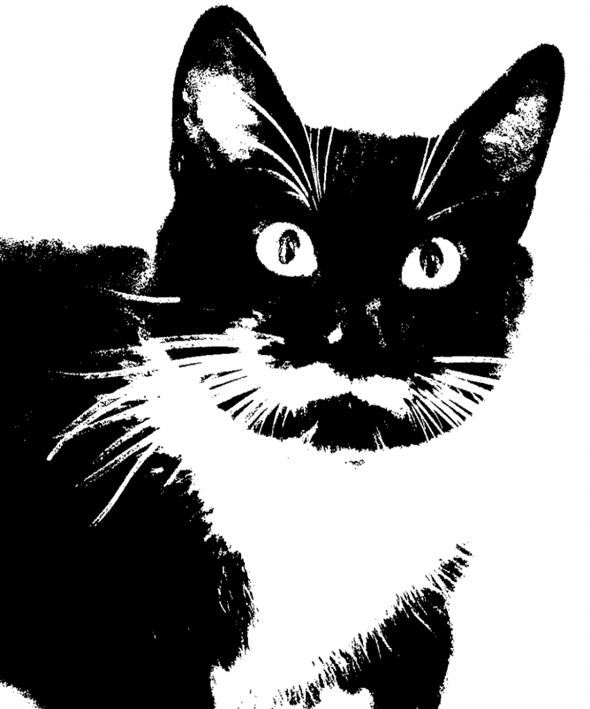
What’s also hard to see in the above picture is that the photo has a lot of small grey artifacts in the borders of the fur. This is exactly what we added in when making the lace picture earlier, but here it is unwanted. An additional step is required for this photo (again for some photos it might be unnecessary).

But before I do that – I’m going to use the Ink command and touch up the pupils to remove some of the glints. Ink is only available in Office 365.

Showing Glint repair using ink tool.

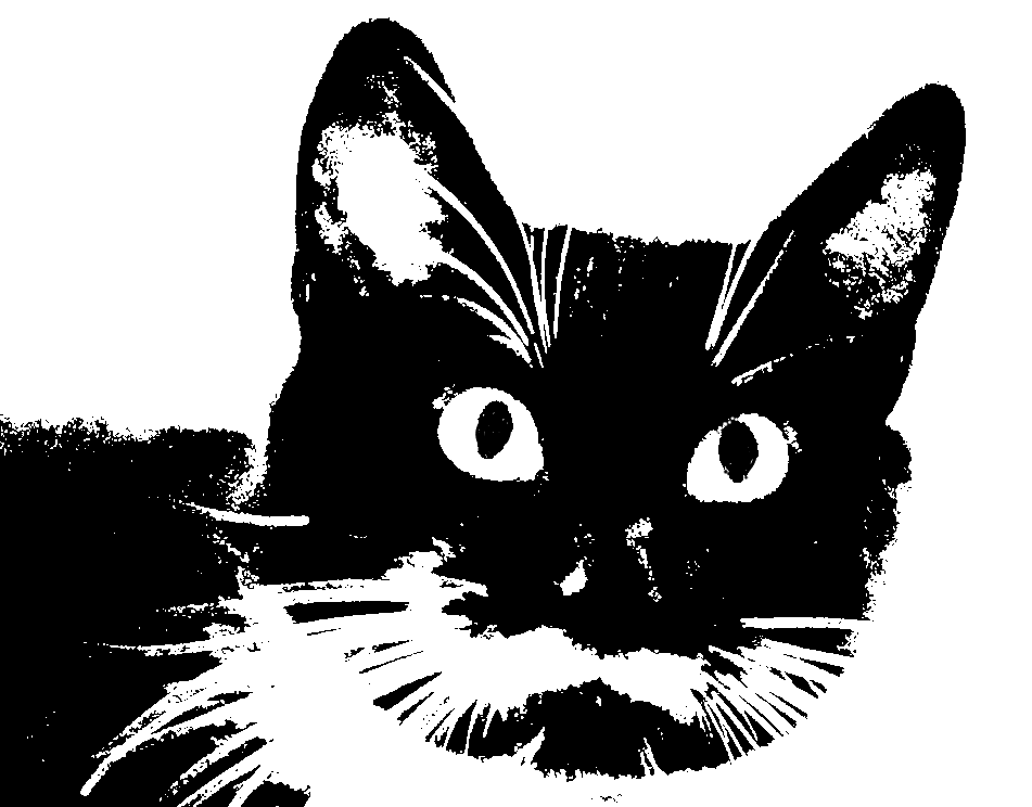
After filling in the glints on the pupils, I grouped the ink layer with the photo. Then I copied and pasted the photo (and ink layer) as a picture. PowerPoint remembers all the photo editing done to a picture (which is why the Reset command works) and applies those steps cumulatively. I want to start fresh and apply the Recolor command to strip out the grey artifacts without losing a lot of detail. After recoloring the photo to 25% Black and White I set the White color to transparent

The same photo, but now with a crisper look

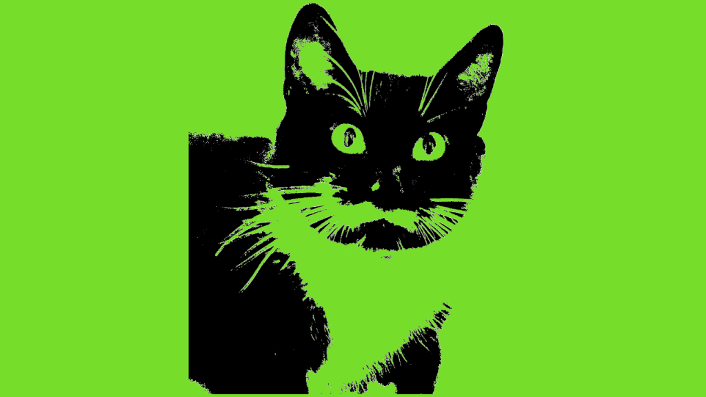
Again, I grouped the photo with bright background rectangle, pasted it as a picture and this time set the black portion as transparent. This is similar to the photo stencil.

Photo with transparent cat

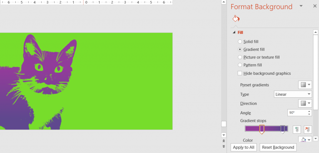
In the final step, set a gradient fill in your chosen colour scheme to colour the duotone.

Setting the background of the slide to colour the duotone

The main elements of this technique are applicable to a number of photo effects. Try them out and see what you get!


This post is originally from 2018 If you want help with the newest and classic features in PowerPoint drop me a line at catharine@mytechgenie.ca