Eat Your Waffles

Ok, don’t eat the waffle chart

In a previous post, I discussed making a Button Bar Chart. That whole process really inspired me to think about simplified charts for presentations.

Which got me thinking about Waffle Charts.
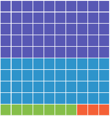
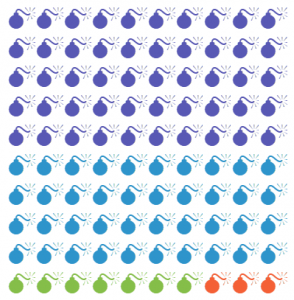
Note how the smallest group stands out

Waffle charts are excellent for looking at data sets where the smallest numbers are the important ones. You can use colour (as I have above) to make those numbers stand out.

But oddly, I don’t see people using a lot of waffle charts in their presentations. And there is no template for a waffle chart in Excel.

You can find some interesting ideas about building Excel waffle charts for dashboard purposes and I recommend this article to you: Interactive Waffle Charts in Excel

However, I was looking for something different. Something that wouldn’t have me counting and colouring cells manually (shudder).

Building the Waffle

I chose to build the waffle chart using a series of conditional formatting rules. The first step was creating the formula to count the cells of the waffle.
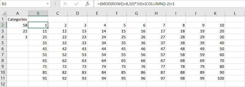
Counting the cells in a 100 grid waffle

In case the picture is a bit small, the formula used here is:
=(MOD(ROW()+8,10)*10)+(COLUMN()-2)+1

This uses the row and column position of the cell to count from 1 to 100 in a 10 by 10 grid.

I then built on that base formula with this monster formula:

=IF((((MOD(ROW()+8,10))*10)+COLUMN()-1)<=’5 Category Waffle’!$A$2,’5 Category Waffle’!$A$2, IF((((MOD(ROW()+8,10))*10)+COLUMN()-1)<=(‘5 Category Waffle’!$A$2+’5 Category Waffle’!$A$3),’5 Category Waffle’!$A$3, IF((((MOD(ROW()+8,10))*10)+COLUMN()-1)<=SUM(‘5 Category Waffle’!$A$2:$A$4),’5 Category Waffle’!$A$4, IF((((MOD(ROW()+8,10))*10)+COLUMN()-1)<=SUM(‘5 Category Waffle’!$A$2:$A$5),’5 Category Waffle’!$A$5, IF((((MOD(ROW()+8,10))*10)+COLUMN()-1)<=SUM(‘5 Category Waffle’!$A$2:$A$6),’5 Category Waffle’!$A$6,0)))))

The sheet BTW is called 5 Category Waffle.
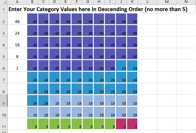
The 5 category waffle formula result

The formula checks the position number of the cell generated by the base formula and sees if it is less than or equal to the number of values in each category in column A. It then returns the value of the category in each cell.

Because I wanted to put symbols in the cell like these examples.
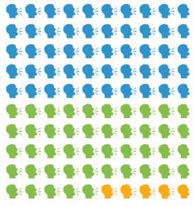
Talking Heads waffle chart
Bombs waffle chart

I took that monster formula and made it into a named formula.


This made building the conditional formatting rules much easier to do(simply because the conditional formatting dialog is so cramped).

Lastly, I built a series of conditional formatting rules to change the background colour of the cell based on the value returned by the formula. For the waffles using symbols, the rule formats the colour of the font, instead of the background.

A couple of additional pointers

  • To create a perfect grid, switch the view in Excel to Page Layout View. Page Layout View uses the same measurement scale for both row height and column width. Set your measurements here.
  • For the symbol waffles, use the File> Options>Advanced> Display Options for this worksheet and turn off the display of gridlines. That way when you copy the waffle, the gridlines will be invisible.


This post is originally from 2018. If you want help with the newest and classic features in Excel & PowerPoint drop me a line at catharine@mytechgenie.ca

Button Bar Chart

Simple or Complicated?

Simple or complicated? It’s been my observation that anyone can make a subject sound complicated – but it takes real understanding of a topic to simplify it in a way that is meaningful.

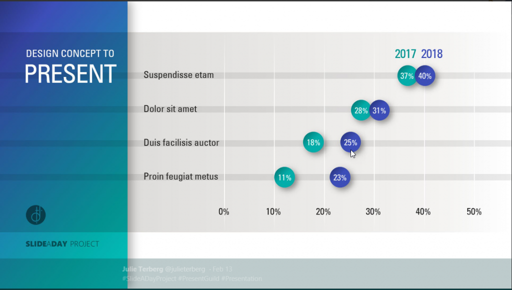
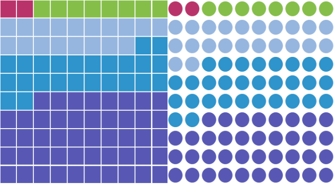
This is why, when I saw this sample slide below from designer Julie Terberg, I sat up and paid attention. Here is a wonderful example of a chart that is simple in a beautiful and useful way. Immediately, you can see that an audience would find this chart easy to read and understand

Julie Terberg’s Button Bar Chart from her #SlideADayProject project

I paid even more attention when I saw the way that Neil Malek put together an Excel version of the chart. Neil introduces a clever technique using shapes in data labels.

Unfortunately, Neil’s clever technique was only available in Office 2016. I wanted to build the chart in Office 2010, for the benefit of my clients still using 2010.

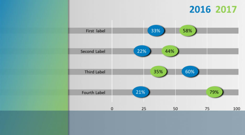
Button Bar Chart Slide, in PowerPoint 2010

I think that in the end, I succeeded. If you are interested in building this chart, and like me you are restricted to Office 2010, then I have a few pointers for you.

Button Bar Chart Pointers

  • Data Labels in 2010 can not use shapes. Instead, I tweaked the Shadow setting for the label, by setting the colour to match the fill on the label and the size to 150%. I left all other settings to zero. Shaping the label this way means that you can never achieve the circle that Julie used in her example. Instead, the best you can do is a lozenge shape. You can modify this when you change the font size in the label.
  • But once you’ve used the Shadow to enlarge your button, you can’t use it to shadow the data label. I solved this problem with an old fashioned solution. I made two charts (a 2016 and a 2017 chart). The two charts are grouped together. Each chart has a data label for the year and a data label for the shadow. In the example below those labels are using the 1 values. The column labelled 2016 value is the length of the bar.
Button Bar Chart Data layout
  • The Shadow column must proceed the 2016 column or your shadow will wind up on top of the 2016 label. Also format your labels in that order as well, or the shadow will temporarily be on top of the 2016 label.
  • Format your shadow and label to the same font size.
  • The Chart Element selector on the Format Tab of the Chart Tools ribbon is your friend. Its’ really the only reasonable way to select the shadow data labels once they are under the visible label.
  • Link the label text to the cell in in Excel by using the formula bar and typing in the linking formula to the cell. This allows you to update the chart, by changing the text in the cell. A bit finicky to set up; but it will save a ton of time in the long run.
  • The best way to take this chart into PowerPoint is by copying/pasting the chart – as an image. Which means that you’ll need to presize the chart in Excel, so that text is not distorted by resizing once it is pasted into PowerPoint. Again, its a bit finicky – but worth it.
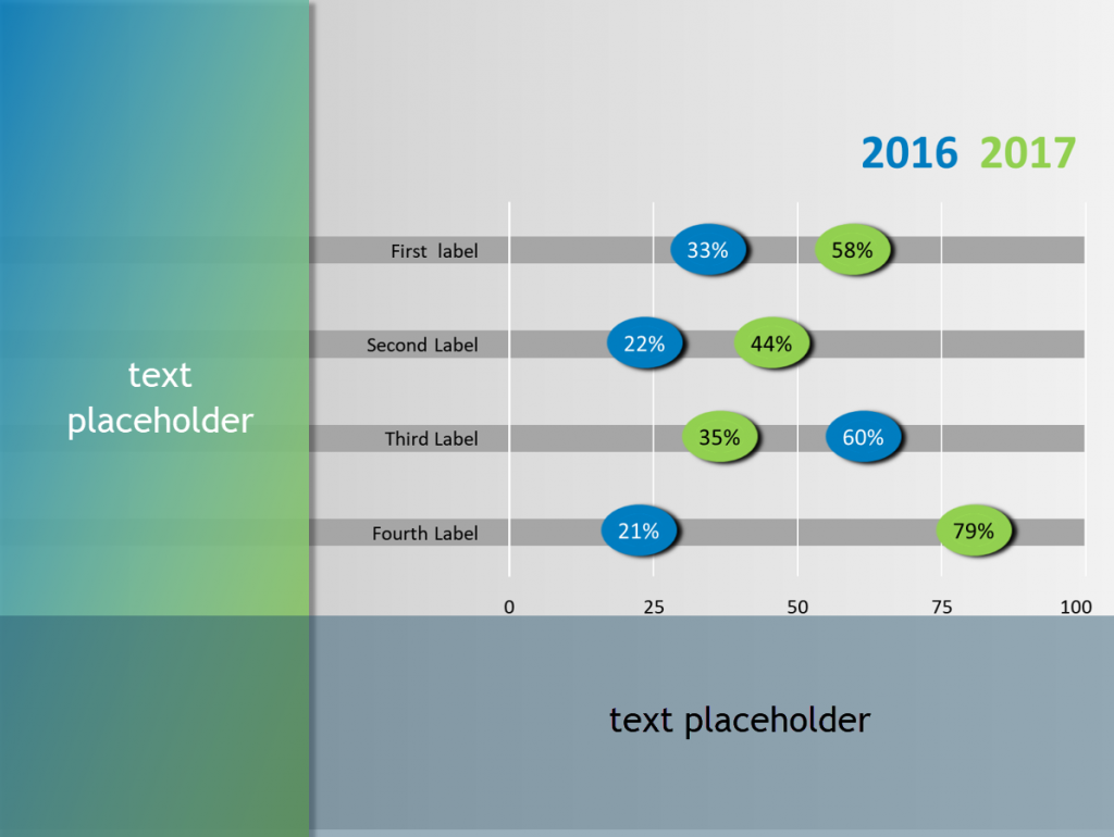
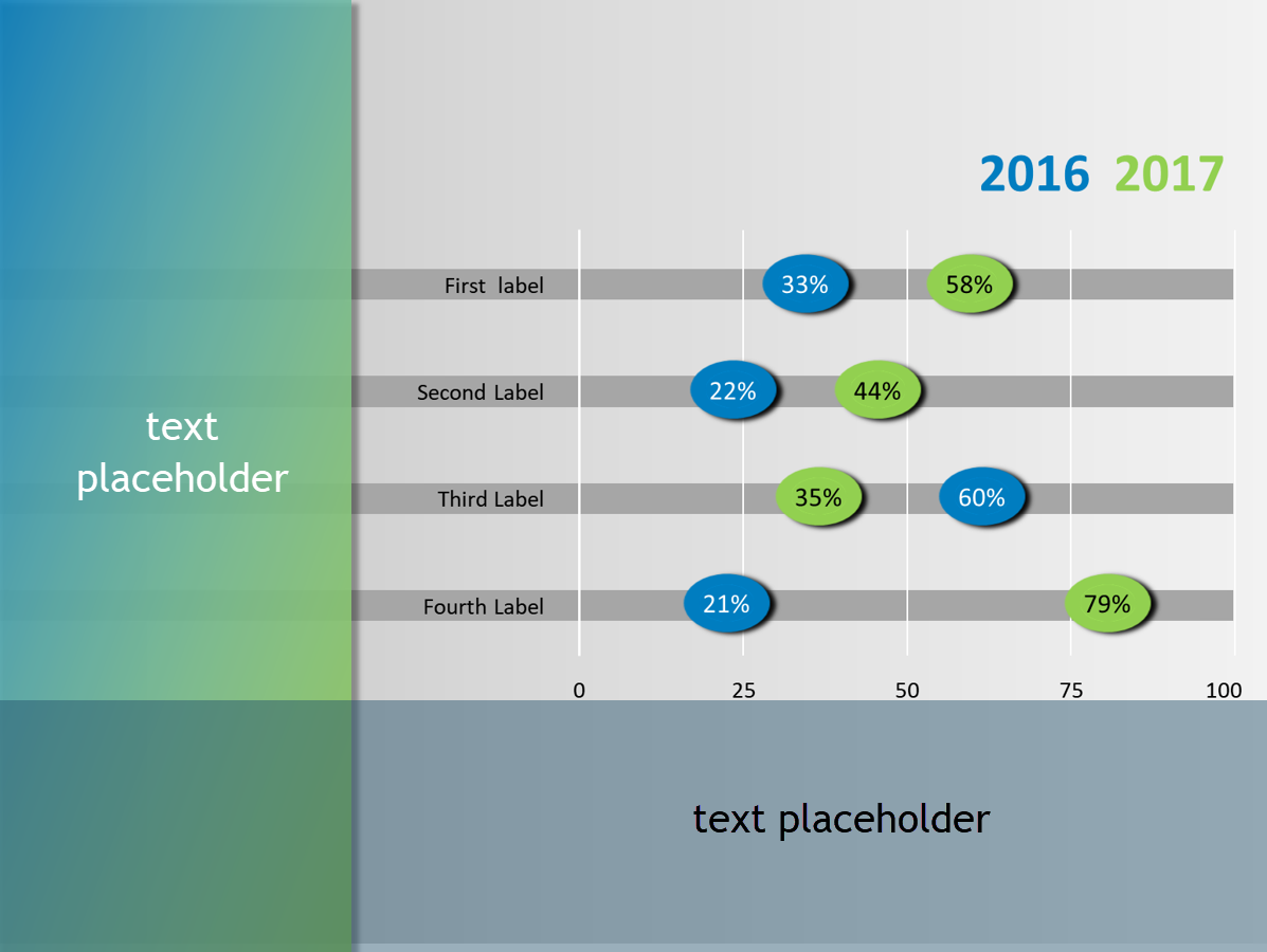
  • In PowerPoint, I created a layout, with text placeholders on the left and bottom of the slide.

    Layout has text placeholders on left and bottom of slide

All in all, a pretty reasonable version of Julie’s stellar design.

If you want to follow Julie Terberg and Neil Malek on Twitter, you’ll find them here.


This post is originally from 2018. If you want help with the newest and classic features in PowerPoint drop me a line at catharine@mytechgenie.ca
Generating Random Numbers and Letters

Need to generate a random number? Excel has two formula variations that can do that for you.

The first is RAND, it generates a random value between 0 and 1. But if you need larger values, try RANDBETWEEN.

RANDBETWEEN generates random numbers between a bottom and top value that you specify.

Lastly, if you need to generate a random letter value – try this formula: =CHAR(RANDBETWEEN(65,90))

In this formula the CHAR function returns the character symbol specified by a number. Letters A-Z are between 65 and 90.


Pictures and Transparency

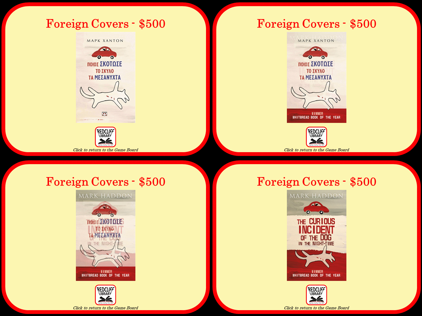
In my last post, I mentioned I was working on a Jeopardy game in PowerPoint. In this game I want to present a series of visual clues before the answer is revealed. The audience is presented with the foreign cover for a popular book and has to guess the name of the book.

Can you guess the book, by seeing its foreign (Greek) version cover?

I want to slowly reveal the English book cover, by gradually making the foreign cover more transparent. With this particular cover, I also wanted to crop the foreign cover image to reveal additional clues. Each clue will be revealed by a click of the mouse.

Hmm is this a problem? I can not control image transparency in PowerPoint, there is no option for this in the Picture Tools menu.

Nope, no problem at all. You can control image transparency by:

  1. Create a shape the same dimensions as your picture.
  2. Remove the outline for the shape.
  3. Change the fill option to Picture or Texture Fill and insert the picture file.
  4. Transparency will now be available

Its’ interesting that placing a picture inside a shape allows you to manipulate that picture as if it was a shape. This concept allows me to play with things like irregularly shaped (non-rectangular) images as well.


This post is originally from 2018, looking at PowerPoint 2016. Our options for pictures and transparency have improved since then.
If you want help with the newest and classic features in PowerPoint drop me a line at catharine@mytechgenie.ca